Woah did he really just start off a post with a quote? Real original. Oh and an Oscar Wilde one to boot, can’t wait to see the selfies and inspirational posts to follow. Close tab, unsubscribe, block! Ok relax peanut gallery, it’s going to get better from here on out I swear. This is the second post on my blog, so while I’m getting this new project going have patience and check back soon for… well I’m not sure yet but its going to have lots of adventure, architecture, design and people watching.
Subscribe below to get notified as I post new updates or follow us on twitter or the gram.
Get the latest conservation updates, be inspired to create change, and learn about ways you can join along as we discover amazing and interesting places around the world.
On losing Frank Gehry, and remembering the decades he spent transforming material, space, and the future of architecture forever.
When I woke up today I didn’t plan to write an obituary, I’ve never written one before. I’m still processing the news that Frank Gehry has passed away. For those of us obsessed with the built world, it’s a strange feeling when someone who shaped your understanding of it leaves this world. So in respect to that feeling, I felt compelled to do my best.
In an industry increasingly seduced by glossy renderings, Pinterest-board aesthetics, and copy-paste floor plans, Frank Gehry insisted on the value of getting his hands dirty. On messy model-making. On the untidy sketch. Not because he wanted to “messy” looking structures, but because he believed that beauty in the modern era didn’t rely on classical ornament, beauty emerged from process, from the artistry of taking up space, the allure of exposing structure, and manipulating raw material with intention and honesty.
It also can’t be ignored that his success has, in many ways, obscured the real sensitivities of his work. “Starchitect” is a word people toss around easily, and I suspect Gehry was one of the reasons it exists at all. But reducing him to celebrity misses the deeper motivations. In addition to all the requirements of an architect, that is shelter, function, operations, maintenance and so on, Gehry truly thought like an artist, loved music like a musician, and built like someone trying to translate those emotions into form.
Moving through his buildings with that in mind translated my appreciation of his work more clearly than simply criticizing the underlining structure or use of surface material, and this became the lens that I appreciated his work through. Admittedly it was through the joyful appreciation of wonder, an area where professional criticism had to compete with spiritual nourishment. I go to Gehry’s buildings to hear the music and see the art.
In fact, in one Gehry enthusiasts opinion, his love for art and music didn’t just influence his work; it animated it. He drew inspiration not from completed masterpieces, but from the lived, chaotic lives of the artists themselves; the cluttered studios, unfinished thoughts, the sway between unwavering confidence and crippling self doubt, of the experiments that refused resolution. His buildings feel like jazz music, rock-and-roll, R&B leaping from high to higher, keeping time like a structural cadence before suddenly breaking free in a surprising burst of emotion. Unlike the repetitious structure of a greek temple or Miesian tower, he broke free from the mathematical grid and codified arrangement of form.
Witnessing a Gehry building for the first time, you feel all of this at once. Awe so immediate it actually hides how traditional his methodology was: windows proud of their walls, a clear celebration of entry, and the drama of level transition. Even the surface treatments of his most sculptural projects are often lifted directly from their surroundings. The novelty of his work blinds you to the classical training beneath.
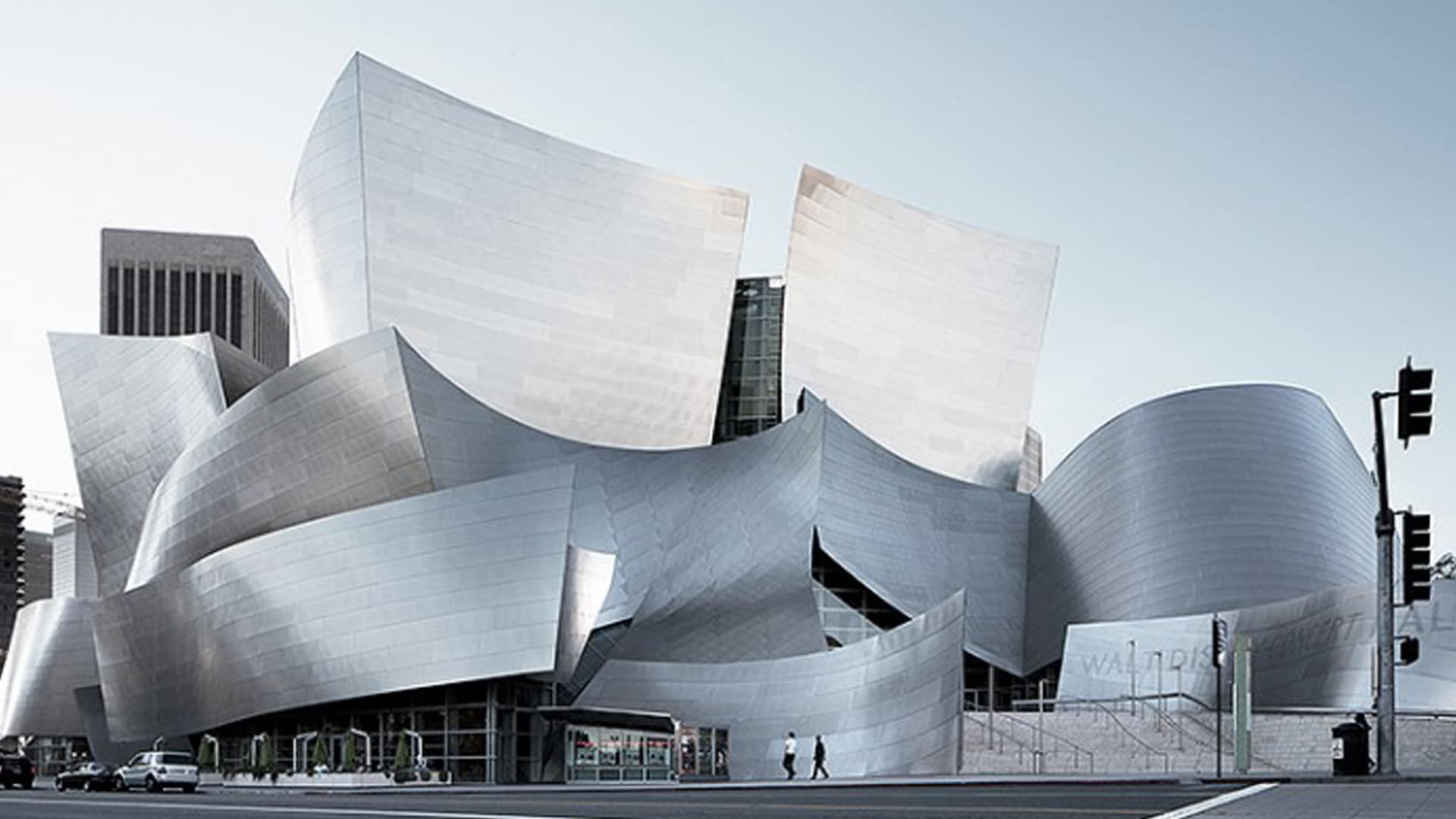
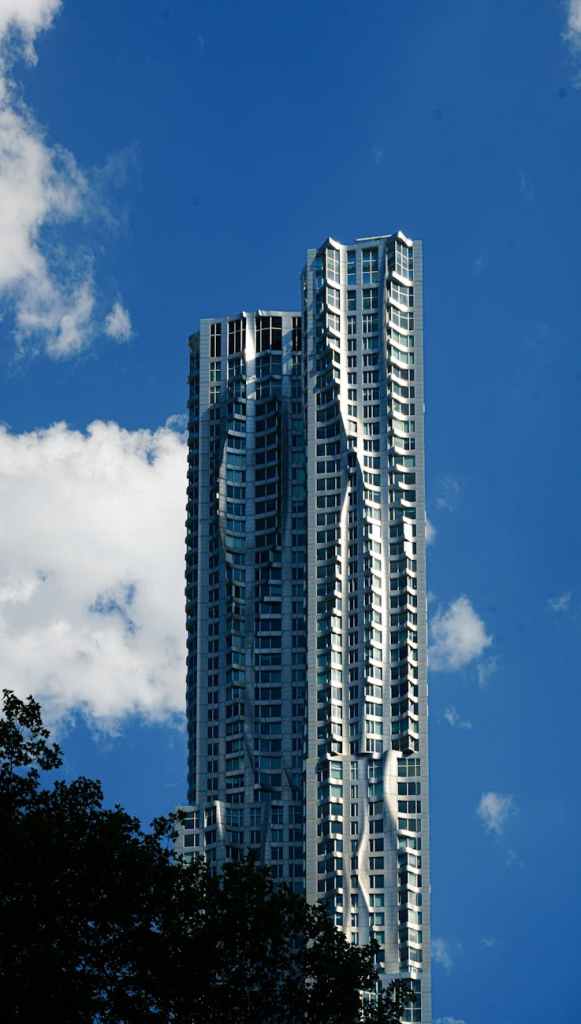
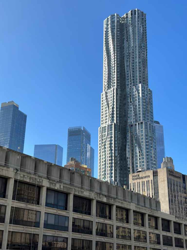
Take 8 Spruce Street in New York: the façade ripples toward the river, merging tower and site in continuity. However on the city facing side the building becomes a standard skyscraper, only instead of one singular vertical form, he stacks the masses as if combining the skyline into one form. Or the University of Technology Sydney, whose tumbling brick-facing facade echo the historic Australian street it rises from. Even the massing is often a direct extension of context rarely fighting with its neighbours, but mirroring their effect. The boxy towers of L.A. sprouting out of the Disney Concert Hall, or the colourful metal planes intersecting like makeshift Costa Rican rooftops are just a few examples of this.
After all that’s said and done, what Gehry adds is movement. The tug of a street intersecting another street. A park pressing into the building’s side, shaping it like clay. Clouds dissolving into the sky like the transparent parts of his buildings dissolving with them. In all these cases, you can almost feel the neighbourhood sculpting the building, moulding it, informing him on what it wants to look and feel like.
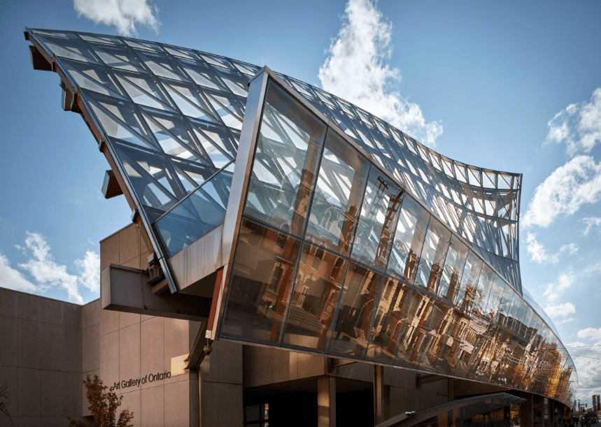
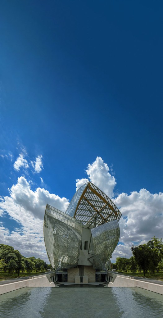
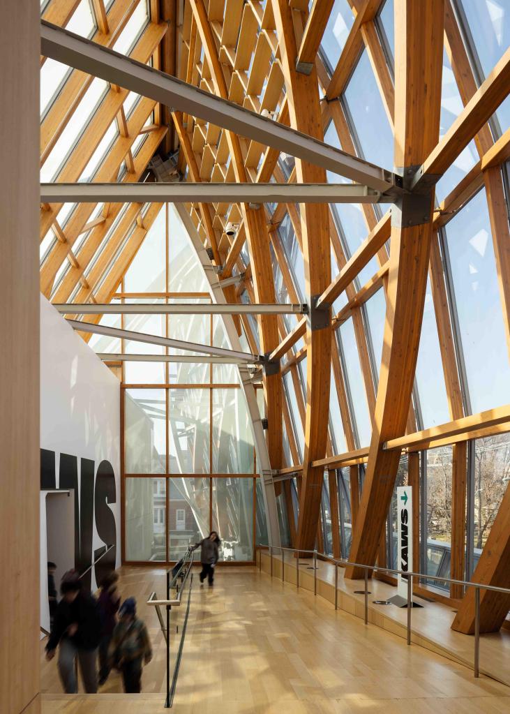
And nowhere is this more so than in in my home town of Toronto where I first met the work of Frank Gehry. While the Bilbao Guggenheim and the Fondation Louis Vuitton gather the spotlight, it’s in the code-restrictive, budget-conscious crucible of Toronto that Gehry performs a quieter miracle. The AGO renovation becomes a ribbon of wood threading through a dense city block, wrapped in curving glass, gleaming metal, and a path that affords you the time to wander.
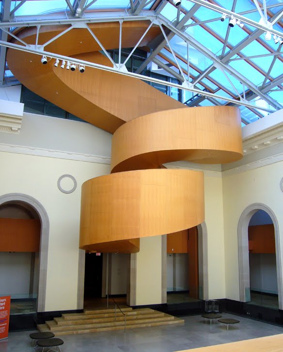
You enter through a low-slung threshold, compression before expansion, a trick undoubtedly learned from Frank Lloyd Wright. The lobby and ticket area ripples with curved plywood to what is essentially under the soaring glass sail above. You trade your entry ticket and cross into the historic Grange courtyard. Above you, the AGO staircase unfolds like northern lights, curling, looping into itself, disappearing only to return again as it rises out of the now glass roof and into the sky-coloured metal addition above.
For me this room is a piece of magic. Like Fantasia. If you stripped the world of light and sound and poured all remaining energy into the massing of the building, I swear the movement you’d see is the same movement found in those wood floors, staircases, and wandering paths that meander their way around the porticos, zig-zigging against the boxy front, and spiralling up into the sky. Here, wayfinding becomes architecture; architecture becomes music, and music takes a sculptural form.
AGO Grand Staircase,Toronto, CanadaFrank Lloyd Wright, Guggenheim, NYC.
Let’s pause and consider for a moment what Gehry has done here. Drawing a direct line back over half a century ago, Kandinsky and others complained that Wright’s Guggenheim competed with the art it hosted, that the building he designed was too modern to showcase their work in. It felt as though Wright had taken the opportunity to set the drafting table aside, and adopt the hat of the artist himself. That argument persists today, and I don’t think its resolved here either, as Gehry’s own sculptural presence becomes one of the greatest artistic interventions in the building, and perhaps in the city as well.
Here however, Gehry makes the balance feel almost fluid, finding an equilibrium between gallery and exhibition. In his hands, the surrounding rooms tumble into one another like boxes nudged from a shelf, some poking through, some slipping down, some suspended from above. The experience is pure pleasure: intuitive paths, clear vistas, grand reveals and intimate moments, art held but rarely overshadowed.
Leaving the AGO is like waking from a dream. Everything made sense while you were inside, but it becomes more difficult to explain once you step back out onto the street. Looking back at the bowed glass façade reflecting an ordinary Toronto street made feels extraordinary: Victorian houses bending with the curve, streetcars scattering their red glow, passersby flickering across panes, all together activating the cadence of the soaring branchlike wood ribs that support them.
Architecture like this takes time. It isn’t instant. You can’t ignore it as it implores you to listen. You have to live with it, watch it age, shift, patina, adapt. Lady Morgan once wrote that “architecture is the printing press of the time and age it was erected in,” and that thought feels especially powerful now. Stepping back from my first encounter with his work at the AGO, I find myself thinking about the full arc of his buildings, where the world of Architecture was when he started with his small experimental home in Los Angeles, how it sculpted the industry to evolve with his distorted jewel box structures scattered across Europe, to the distinctly Canadian expression he carved into Toronto, not just with his building, but with the inspiration it afforded a young city becoming its own.
Together they form a record of a life spent reshaping the world of architecture, and it’s only now, in his absence, that the magnitude of that record fully settles in. Starchitect or more, we’ve now lost one of the greatest architects of all time, and what a privilege it was to live in the years Frank Gehry was shaping.
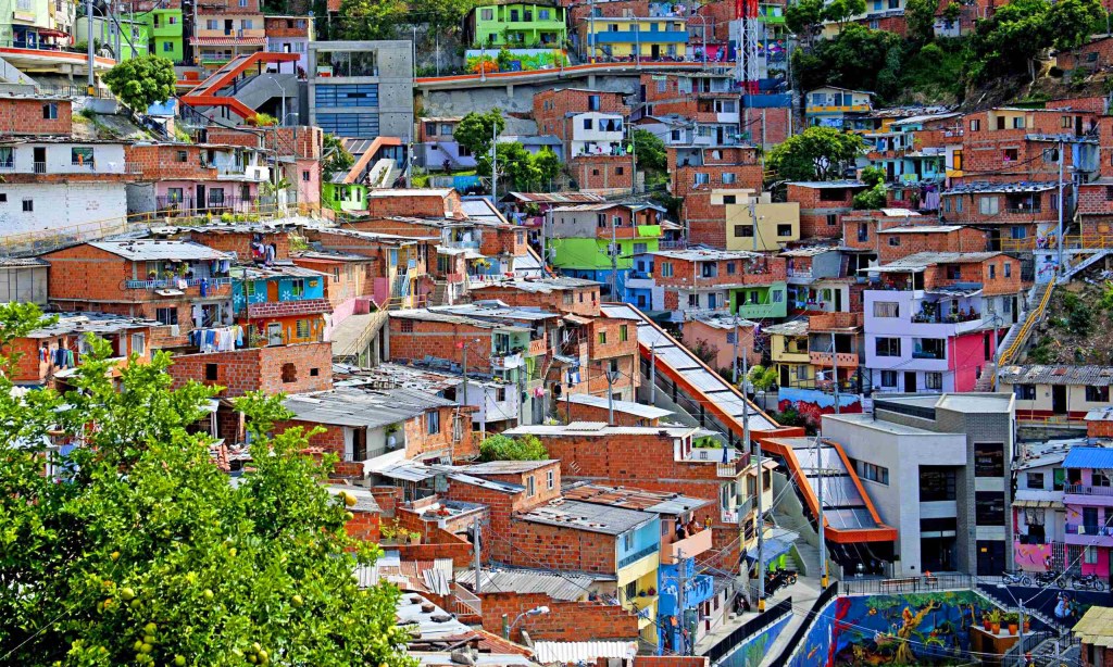
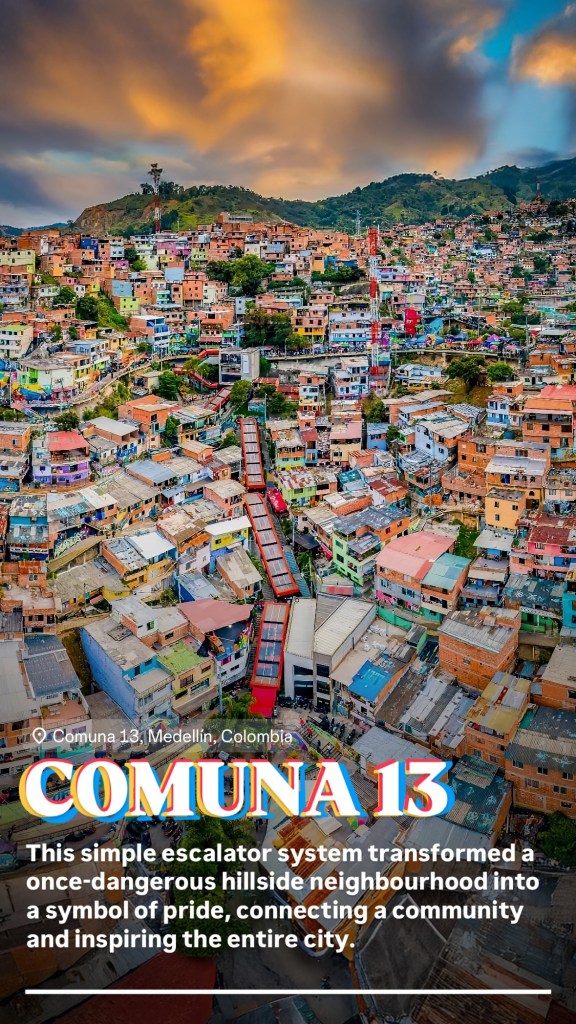
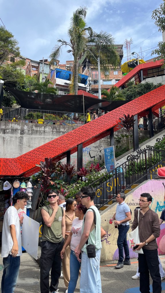
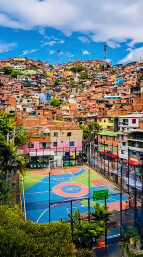
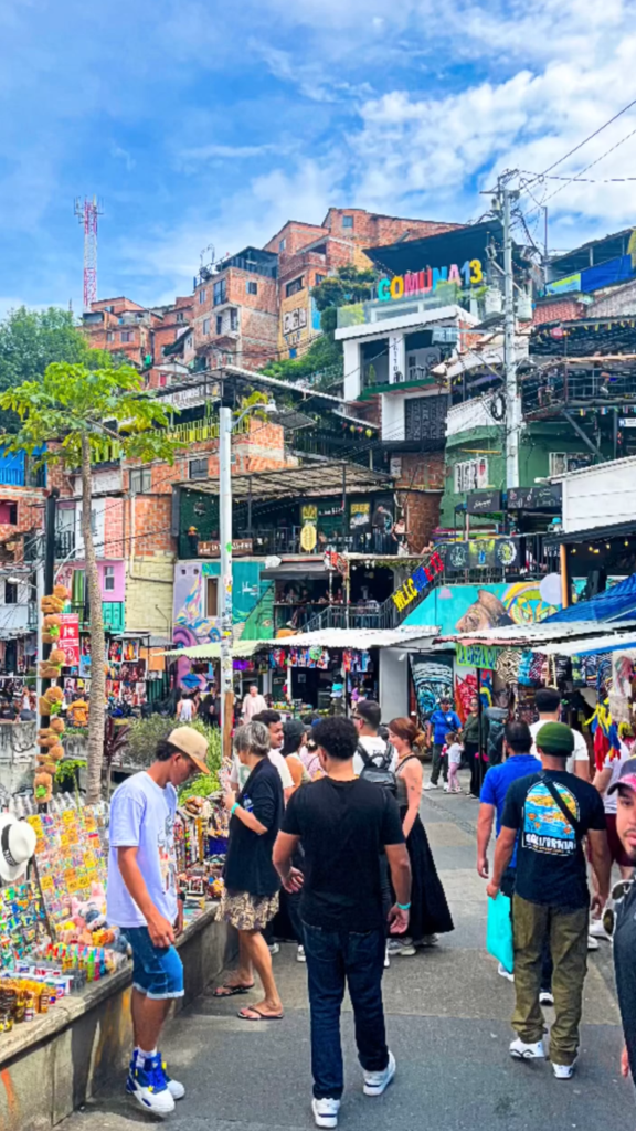
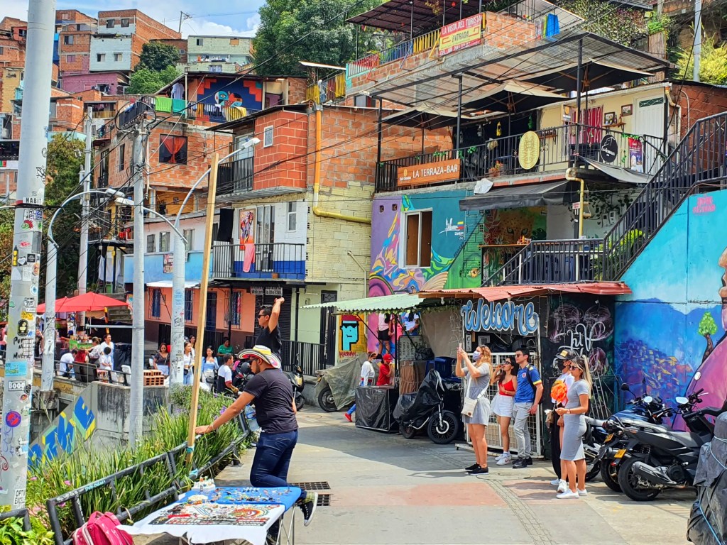
Cities spend billions trying to “activate” public space. Comuna 13 did it with brick, paint, music, and a set of escalators clawing up a mountainside. Walking into it feels like stumbling into a city built on improvisation—walls turned to canvases, staircases to storefronts, every corner buzzing with kids, vendors, and beats spilling from balconies.
I’ve never seen a shopping mall so alive, yet this wasn’t a mall. This was a hillside once written off by the city, now vibrating with art, commerce, children darting between murals, and the hum of escalators ferrying people up steep slopes. Malls dream of activation like this. Developers sketch endless diagrams about “community engagement.”
But to feel the present, you have to know the past. Not long ago, Comuna 13 was shorthand for violence—the hillside where Medellín’s cartel wars and paramilitary clashes left scars both physical and invisible. In the early 2000s, government forces launched operations here, raids that tried to wrestle control but often deepened the trauma. For decades, this was a neighbourhood defined by absence: absence of infrastructure, absence of safety, absence of opportunity.
The turning point wasn’t just state action but state investment. Public escalators were built to climb the impossible slope—suddenly the city above and below connected. Then came cable cars linking Comuna 13 to Medellín’s transit spine, pulling the hillside into the flow of the metropolis. Infrastructure didn’t erase history, but it carved out possibility. Murals spread across walls like counterweights to memory, telling stories of pain and resistance. And commerce—tiny, informal, relentless—filled in the rest.
Today, Comuna 13 is a global pilgrimage site. Tourists pour in to walk its narrow alleys and ride its orange escalators, to hear local guides narrate the violence and resilience, to photograph graffiti that is as much documentation as decoration. What shocks me isn’t just the colour or energy—it’s how architecture and art here hold trauma without sterilizing it. A place once feared is now one of Medellín’s most visited neighbourhoods.
The architecture is not the polished kind. Clay brick stacked like improvisation, staircases turning into balconies, balconies into shops, shops into stages. It’s as though the hillside itself exhaled and produced a built organism. The escalators—those famous orange veins—slice through, not as luxury but as survival, dignity. Suddenly the city above and below connects. Suddenly commerce spills, murals climb, tourists wander, and locals claim their own narrative.
Standing there, I couldn’t help thinking: this is urban renewal without erasure. No starchitect glass icon, no sterile masterplan. Instead: infrastructure as catalyst, art as skin, community as architect. The graffiti doesn’t decorate—it dictates space. Every surface a manifesto, every turn a reminder that architecture is not just walls but permission to gather, to sell, to perform.
Comuna 13 feels like the anti-mall, yet it outperforms malls in every measure that matters. The density of encounter. The spontaneous collisions. The sensory layering: reggaeton thumping from one balcony, spray paint hissing from another, abuelas selling mango slices under the shadow of a mural of resistance.
It left me wondering: how many cities keep searching for renewal in corporate blueprints, while the true blueprint is right here—modest infrastructure + local will + the rough poetry of brick and paint.
Comuna 13 is not just Medellín’s best neighbourhood—it’s a reminder that the most radical architecture begins not with glass and steel, but with access, memory, and pulse.
In Search of the World’s Most Beautiful Glass Ceiling
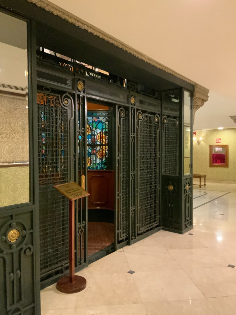
Field Reflection: I wasn’t planning to write about an elevator today. But maybe I should’ve seen it coming. Every trip ends with one. As for now, today I was chasing a memory, a fuzzy, architecturalish, probably warped by Pinterest and Instagram memory. A massive Tiffany’s glass ceiling located somewhere in Mexico City, supposedly with an original wrought iron Otis Elevator. A lobby that feel like I was stepping into a movie set. So I let my internal compass of wandering take over (at this point its feeling algorithmic) and headed out into the heat of the city.
Roma Norte is easy to fall in love with and hard to leave after settling in. It pulses gently with locals and other expats, tropical leaves curling off balconies, hushed cafes where espresso meets mezcal, and one of the highest per capita of dog walkers I’ve ever crossed. But when I’ve wandered long enough among boutiques and tortillerías, a certain kind of architectural nostalgia calls me back to explore more of the city’s denser core.
It was hot, that Mexico City kind of heat, dry but buzzing with sound. I peddled through Hipódromo’s lush rings, then into the rhythm of Centro Historico’s grandeur. Palacio de Bellas Artes caught me first, her white curves and glass-tiled dome. Gorgeous, yes. But not what I was hunting for. Nor was the Palacio Postal, though its staircases and elevators shine like a Fabergé egg. I passed the tiled walls of Tiled house, peered into museums through the scent of tamales and exhaust.
And then, not on a main street, not screaming for attention — there it was.
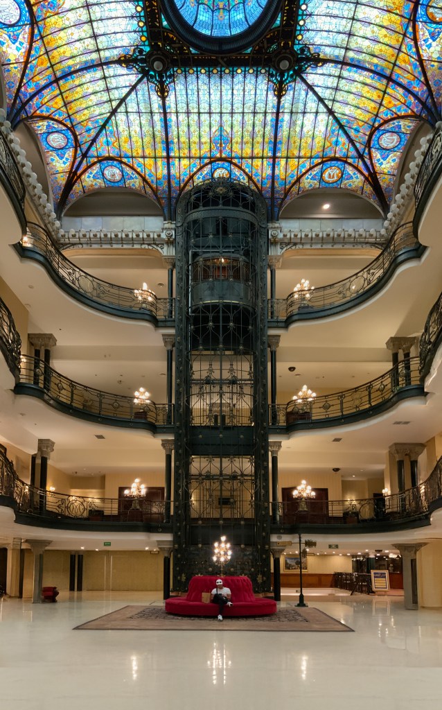
The Gran Hotel Ciudad de México.
Its entrance doesn’t shout. It doesn’t seduce with columns or glass revolutions. It waits—low, wide, shadowed like a velvet curtain half-parted. I pull my shoulders back, tuck in my shirt, and step in like I belong.
Inside, the noise of the city vanishes. Not silenced, exactly—just held at a respectful distance. And then, something pulls me upward. My gaze lifts, involuntarily, as if drawn by gravity in reverse.
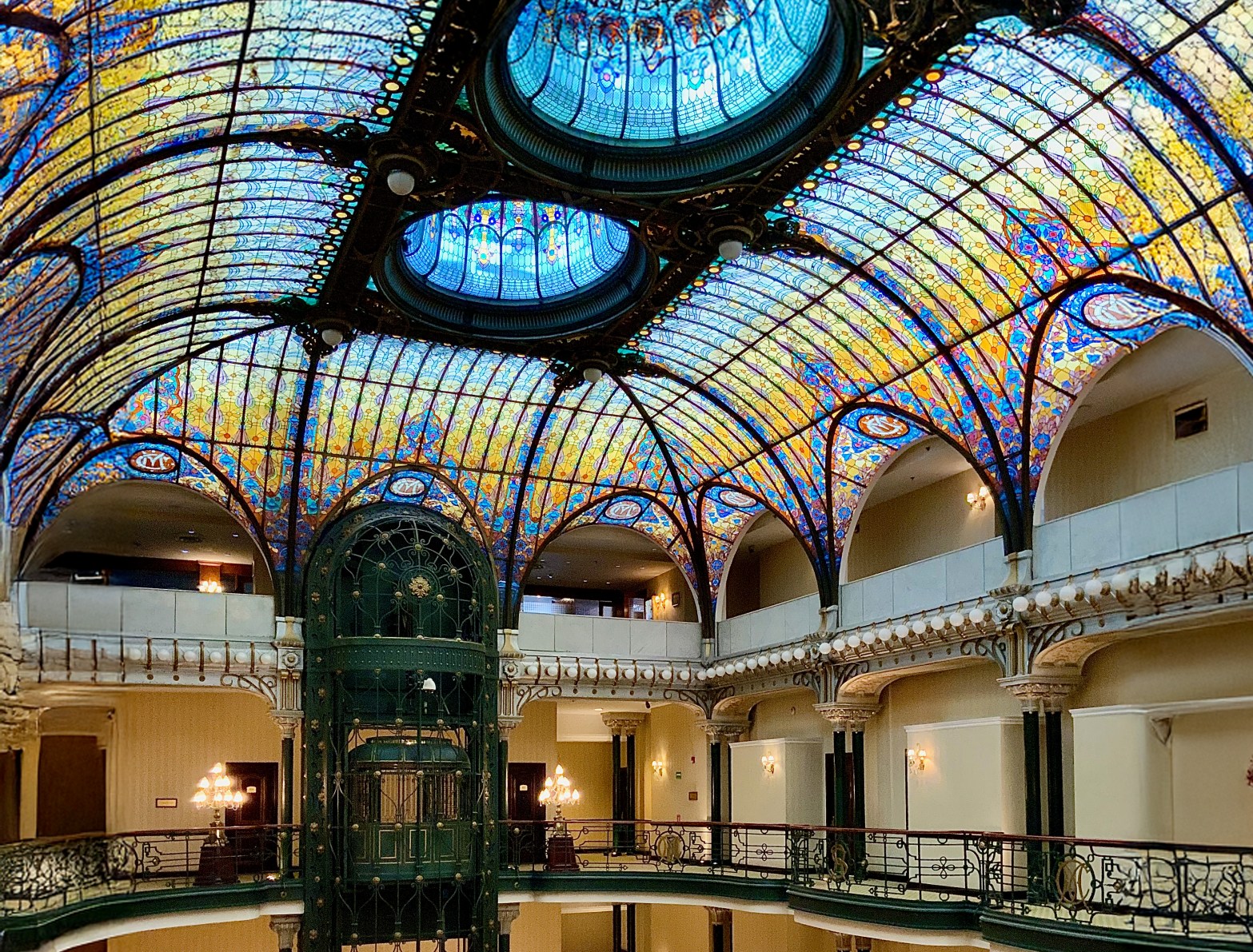
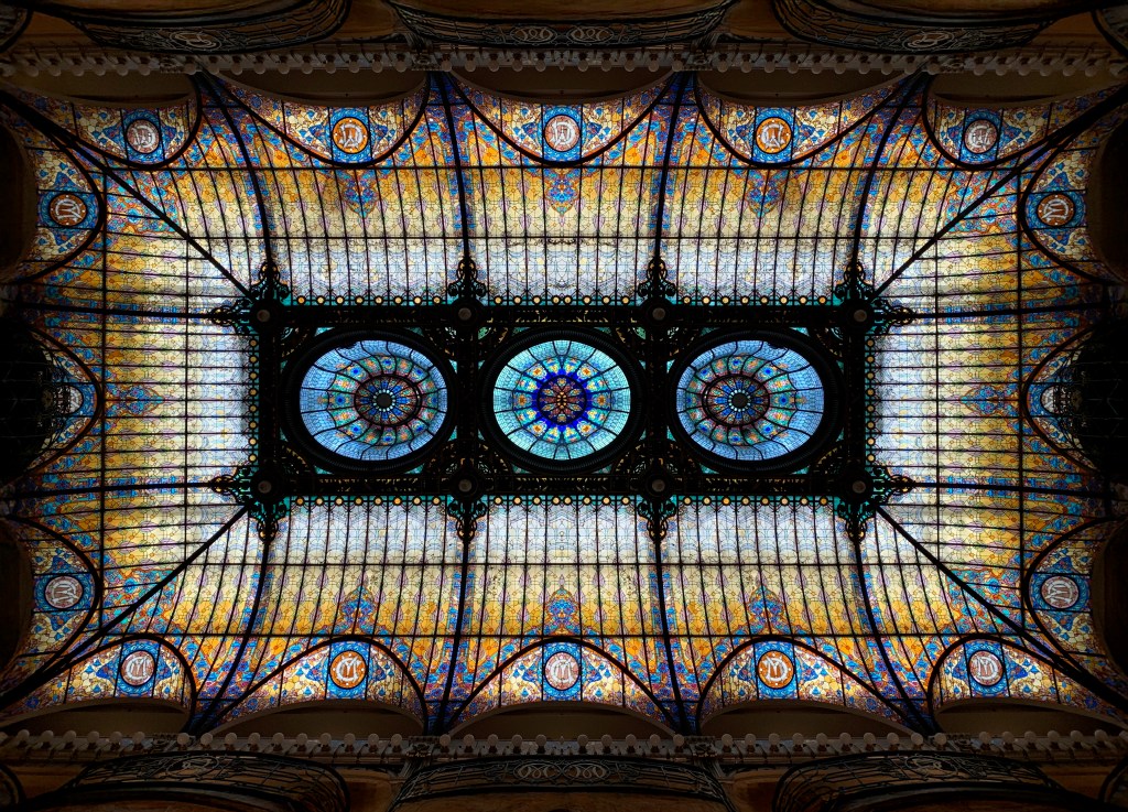
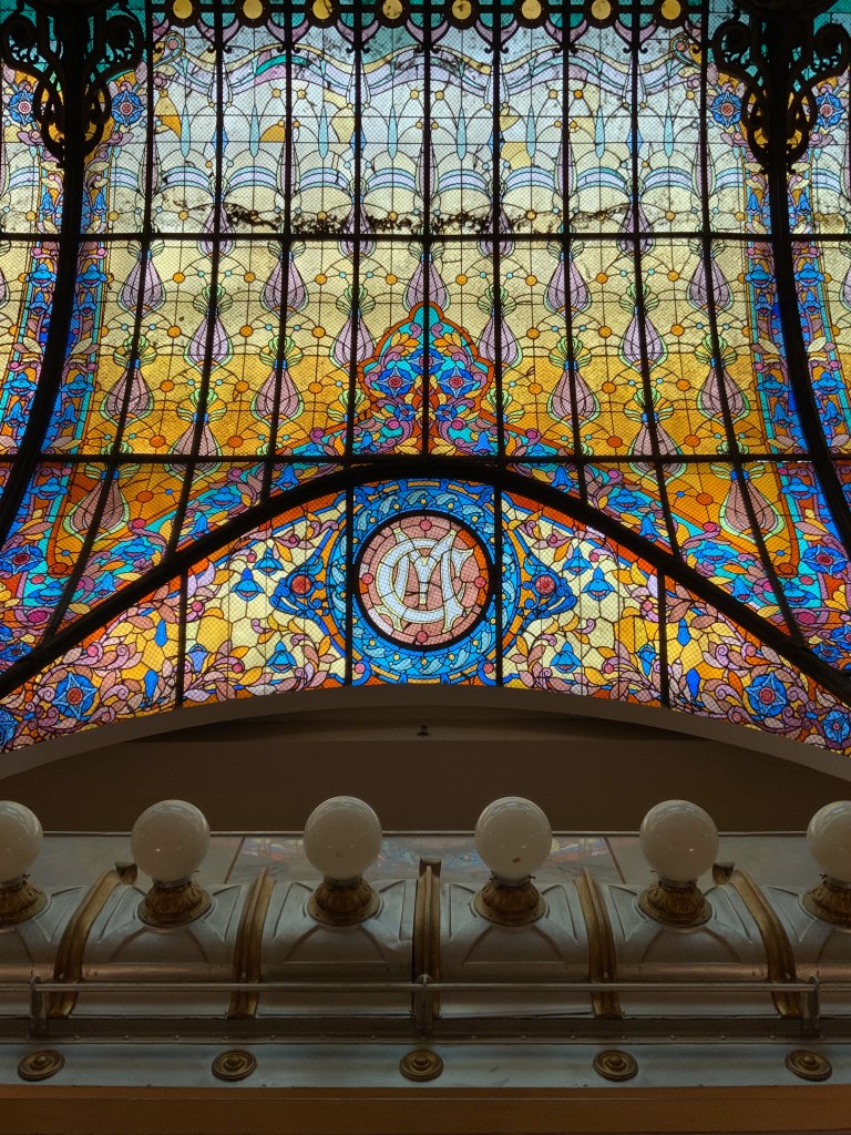
Gran Hotel Ciudad de México Tiffany Glass Ceiling
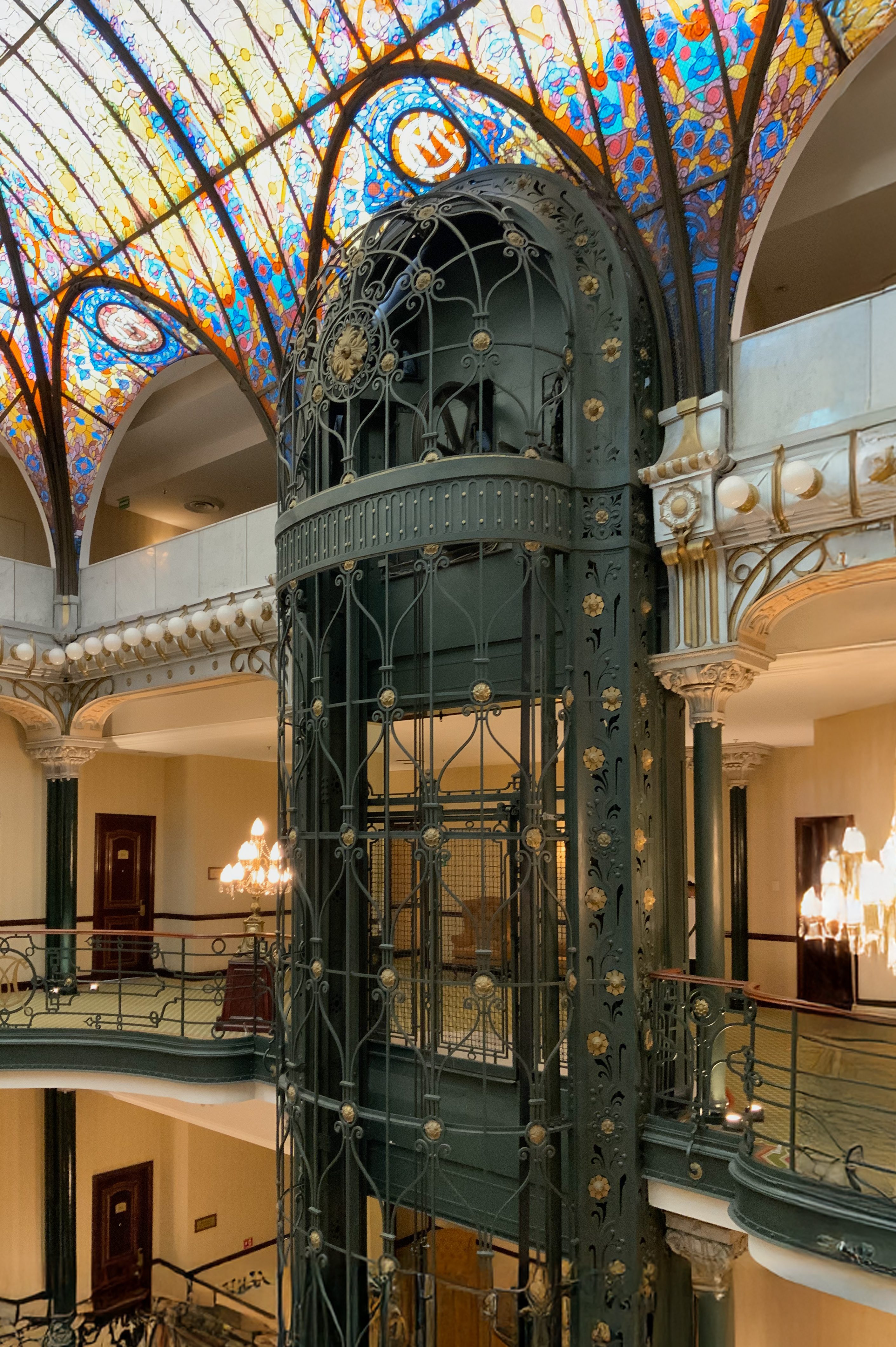
At first: only colour. Not in any order. Just floating, diffused, like stained smoke or memory. Ochres and rose. Soft teals. Lavender bruised at the edges. A hush follows—not formal, not sacred, just… inevitable. The kind of quiet you fall into when staring up through trees. Slowly, it resolves: not a dome, not a skylight, but a canopy of iron and light. Arched like a ribcage. Tiled like a quilt. Suspended—almost impossibly—above everything.
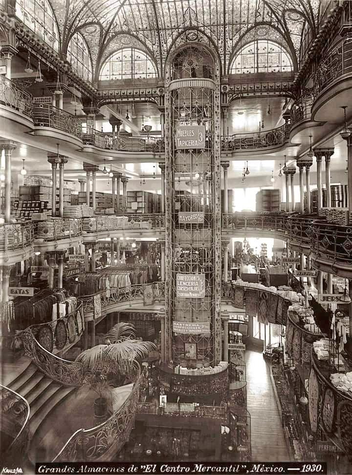
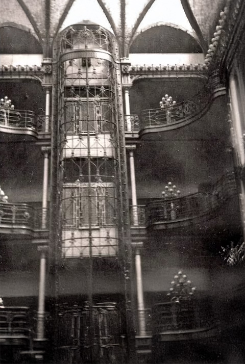
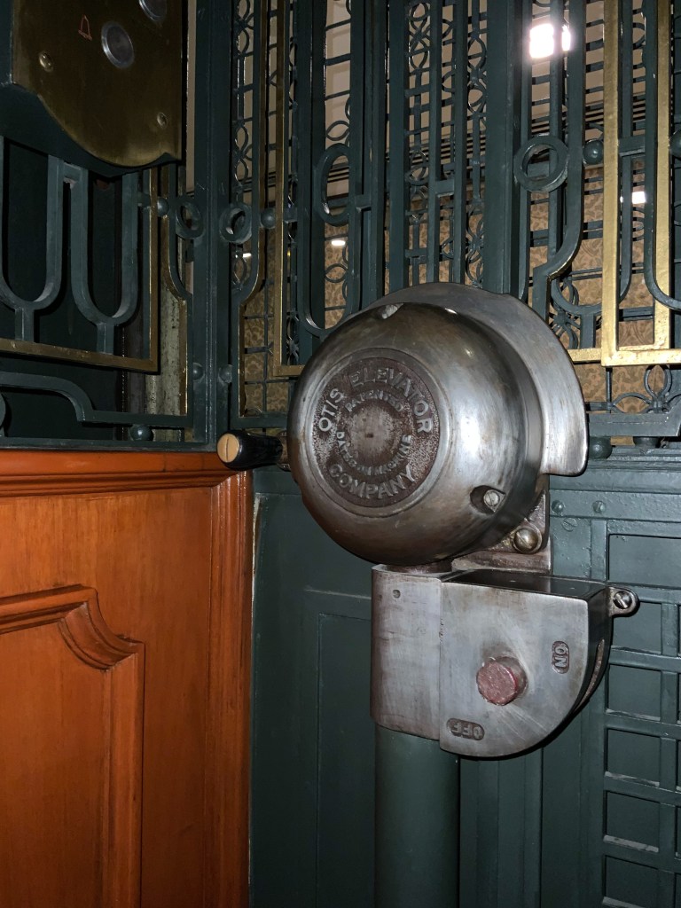
The structure breathes. Iron ribs hold the glass like lace holds skin, flexing with the mood of the sun. This is what turn-of-the-century engineering did best: make strength look gentle. Completed in 1899 as a department store, the building was always ambitious—its verticality not just functional, but theatrical. When it became a hotel in the 1960s, they preserved the bones. The ceiling. The metalwork. And yes—the elevator.
Which is less machine than jewel. Brass and filigree. Art Nouveau dreaming in gilt and wood. I flirt my way into a ride—half joke, half ritual. The operator (yes, there’s still an operator) presses the button with the grace of someone who’s been performing this motion for decades. Tourists come for the ceiling. But it’s the ascent that stays with them.
For a moment, it feels like stepping into early electricity itself—its optimism, its oament. A future we no longer build.
At the top, just beneath the canopy, the spell sharpens. You’re not under it anymore — you’re with it. Up close, the tiles don’t behave. Each one has a wobble, a bubble, a slight tension in the way it catches the light. No two colours land the same way twice. Lavender turns smoke. Teal flickers to emerald. It’s like standing inside a kaleidoscope that’s been taught restraint.
This is where the hotel stops being just beautiful and starts to feel, just special. The glass doesn’t hang. It floats. The iron doesn’t hold it—it cradles it. Unlike a train station, or a warehouse, the steel frame here show’s off how beautiful structure and engineering can be.
It’s not shaped like a hotel because it wasn’t meant to be one. This whole shell—this glorious, glass-topped theatrical atrium, was built as a department store in 1899. One of the first in Mexico City to embrace the spectacle of vertical space. Before it was rooms and guests and chandeliers, it was railings and mezzanines and the slow luxury of looking upward while shopping for French perfume and imported glassware.
That origin matters. Most grand hotels assert themselves outward—they occupy corners, plazas, boulevards. They show off. This building folds inward. It draws you in and then reveals itself. You enter low and quiet. You rise. You look up. You stop speaking.
I didn’t find this place through maps or museum guides. I followed my instinct, the grove in the urban plan and history. Great cities rewards that kind of search: obsessive, imprecise, half-imagined.
Riding the Teleférico to Freddy Mamani‘s Neo-Andean Dreamscape
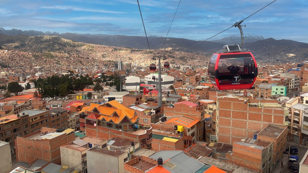
I woke up in La Paz with that specific kind of thrill only architectural pilgrims know. The kind that creeps in your chest when you realize: today you’ll get to see a building you’ve studied in photos for years or click through everytime Instagram’s algorithm finds you, or Arch Daily and Dezeen hits that right note. Today, the wild forms aren’t in your tabs or in dusty PDFs … they’re literally waiting outside. If you’re the kind of person who travels for structures instead of beaches, who rides cable cars just to see the city from a new perspective, then you’ll understand. I wasn’t just visiting La Paz. I was there to meet the Neo-Andean.
Somewhere outside my questionably chosen low budget hotel room and extremely thick alpaca-labelled rough polyester blanket, the red line of Mi Teleférico was already gliding through the city packed with locals on their daily routine. The high-tension cables strung across one of the world’s most vertical metropolises (we’ll talk about gondola urbanism another time), I grabbed my camera (lets be honest, my iPhone) and stepped out into the high-altitude air.
Arriving in El Alto, the shift was immediate and unmistakable. The city plateaued around La Paz below with a kind of raw density, packed with unfinished brick, tangled in cable, wide skies broken by sudden bursts of geometry. What I saw that day wasn’t just architecture—it was voltage. Cultural voltage made visible in concrete, in mud brick clad in chrome, in façades vibrating with more colour than most architects would ever risk.
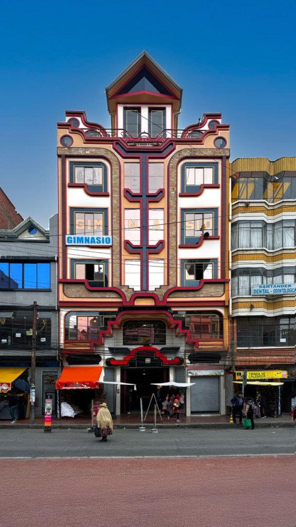
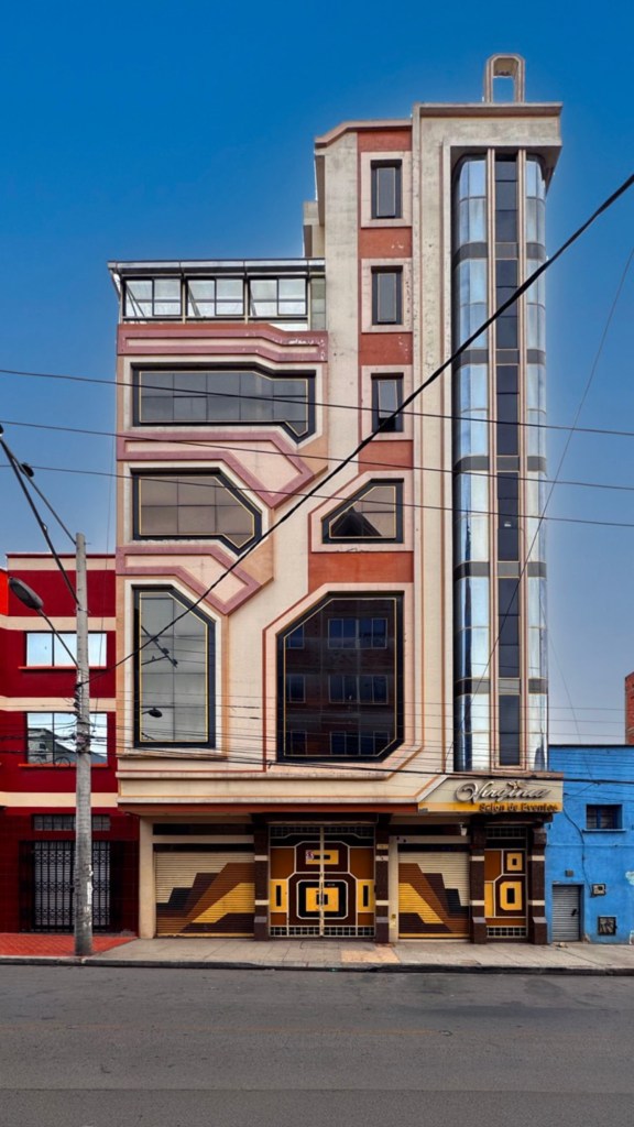
To understand Neo-Andean architecture, you have to first understand what it pushes against. These are buildings born in collision: Indigenous cosmology and European colonial residue, ancestral pattern and postmodern form, memory and modernity, all jostling for space. In the early 2000s, Freddy Mamani Silvestre, a civil engineer by training, and Aymara by blood, began drawing from pre-Columbian geometry and Andean textile logic to reimagine what a Bolivian building could be. Think Ancient Temples and Alpaca Woven Rugs. The results were explosive.
His creations are called cholets – a fusion of chalet and cholo – a name that both satirizes and celebrates their hybridity. But these aren’t jokes. They are proclamations. Where colonial cities rendered Indigenous aesthetics ornamental or invisible, think of Detroit’s Skyscrapers adorned with pan-Indigenous motifs, or Montreal’s use of First Nations figures wedged into Neoclassical pediments, Mamani’s buildings are all his own, they go loud, and are vividly unapologetic.
They are also rare. These are not everyday homes, but monuments commissioned by members of a rising Indigenous bourgeoisie, those select few who have accumulated enough wealth to build not just shelter, but statement. In a landscape shaped by historical erasure, these structures don’t merely occupy space, they reclaim it, lavishly.
I’d seen this instinct before, half a world away. In Malaysia, in the port towns of Penang and Melaka, where the Chinese merchant class of the 19th century built ornate clan houses, structures that fused Chinese, Malay, and British elements into elaborate, performative architectures of identity. Painted shutters, carved wooden screens, ceramic lions perched on tiled roofs. They too were more than houses, they were assertions: We have arrived. We belong. We are not invisible.
In El Alto, Mamani’s buildings do the same, but here, the material vocabulary has shifted. Instead of traditional Chinese aesthetics, there is glass in electric gradients and façades clad in chromatic aluminum, an entire vanity economy made possible by the city’s booming micro-industry of so-called aluminum carpentry, a trade whose advertisements line construction sites with unintentional comedy and real civic pride.
What emerges is a strange and mesmerizing language: Tiwanaku motifs meet Transformers aesthetics. The stepped forms of the Chakana cross sit beside window frames that look like they were ripped from the dashboard of a space truck. It shouldn’t cohere, and yet it does. Each building pulses with coded symbology, the geometry less like a façade than a woven tapestry blasted outward into space. It is part sacred diagram, part sci-fi costume. An architecture not of restraint, but of cultural layering.
The cholets themselves follow a kind of typological triptych. The ground floor is commercial; shops, garages, businesses, the muscular base that connects the building to the economy of the street. The middle is often a salon or event space, some with mirrored ceilings, golden chandeliers, columns wrapped in spiralling light. These are the dream-spaces, where weddings and dances unfold like pageants.
And then there’s the top floor: the private family residence. This uppermost section often departs from the maximalism below. Some are starkly modern, all straight lines and austerity. Others mimic suburban domesticity, complete with pitched roofs and vinyl siding, a vision that feels strangely familiar, like the edge of a Edward Scissor Hands American suburb collaged into an Andean skyline. They seem to dream a quieter dream. Or perhaps, in that final tier, what’s being performed is not ancestral memory but aspiration, arrival into a world that once excluded them.
From the gondola, these buildings snapped into view like architectural glitches, bright interruptions in a sea of rust and brown. They don’t integrate, not at all. They rupture. They insist. It’s not harmony they’re after anyways, it’s an unapologetic presence in the urban fabric.
Western critics often miss this, dismissing the cholets as kitsch or “over the top.” But that critique flattens context. What Mamani builds is refusal. A refusal to be beige, minimal, tasteful in the narrow Eurocentric sense, where style means black-on-black wardrobes, ZARA restraint, and a single sculptural chair standing in for personality.
Step inside and that refusal intensifies: mirrored ceilings, chandeliers in a dozen hues, reflective surfaces that feel ceremonial rather than chic. These interiors don’t retreat from ornament—they exalt in it. Every material shimmers with intention, not in pursuit of luxury, but of presence. Mamani isn’t chasing the International Style. He’s rendering the internal architecture of Aymara identity in full view, after centuries of aesthetic erasure. Taste, here, is not conformity—it’s sovereignty.
Like the clan houses of the Chinese Peranakans, Mamani’s cholets are more than residences—they’re economic diagrams, social maps rendered in aluminum and glass. Their owners are members of a rising Indigenous middle and upper class: wealthy, proud, and no longer willing to tuck their heritage behind plaster or minimalist pretense. These are not homes that whisper. They shimmer. They celebrate.
And in El Alto, that celebration takes on an even sharper edge. This is not just any city—it’s the largest Indigenous-majority city in the world, a place that barely existed in the mid-20th century and has since risen, defiantly, on the Andean plateau. Shaped by migration, marginalization, and an almost brutal topography, El Alto emerged in the 21st century as a rare thing: a city built by, for, and of Indigenous people. To build like this here, to colour the skyline with cosmology, with memory, with mirrored ceilings and Tiwanaku motifs, is not an eccentric gesture. It’s a political one.
Mamani himself said it best: “We’re returning to our own style.”
There was a moment, somewhere above the city, when I stopped trying to analyze the architecture and just let myself feel it. I put on Alt-J, and as “Tessellate” crept in, the cholets’ geometry rearranged itself in my mind—angular, seductive, off-kilter but precise. The track’s baroque-electronic layering echoed the city’s own tension: ornate yet raw, futuristic yet rooted. From there the shuffle pulled me deeper—Tame Impala’s synth-fuzzed spirals giving way to the galloping charge of Metallica, then Iron Maiden. And strangely, it all made sense. These buildings don’t whisper—they wail. They don’t align with minimalism—they solo. Walking through El Alto felt less like navigating a city and more like moving through a mixtape: maximalist, mythic, unapologetically loud.
These buildings need music. Something to match their voltage. If Mamani’s architecture has a soundtrack, it isn’t Bach or Debussy. It’s electric, heavy metal, insistently hybrid. Something you move to. Something that doesn’t apologize.
I didn’t take a map. I didn’t need one. La Paz and El Alto are cities made for getting lost in, especially from above. Riding the gondolas felt like floating across some architectural dream terrain, scanning the rooftops for signs of colour, volume, myth. I wasn’t following a route, I was following a rumour. A shape I thought I saw on the horizon. A name I barely remembered from a bootleg documentary. That’s the nourishment of this kind of wandering: the aimless, obsessive, holy kind. You don’t tour these cities, you hunt them.
By midday I was ducking into buildings I probably shouldn’t have entered, pretending to be lost, lingering in event halls just long enough to photograph a mirrored ceiling, absorbing the silence of a ballroom built for five hundred people who hadn’t arrived yet. Later I stopped dead in the middle of a road, halting traffic, just to get a shot of a façade that looked like an interstellar textile. A bus honked. A vendor laughed. A group of kids stared at me like I was trying to photograph a ghost. Maybe I was.
But I got the photo. I found the building. I completed the mission.
That’s what it felt like, honestly, not an architectural tour, but a mission. A modern exploration. Not for conquest, not even for understanding — but for my own wonder. For proof that the built environment can still surprise you, shake you, leave you giddy and confused.
If you want to go deeper, to feel the texture of these spaces beyond the photographs and my ramblings, watch Cholet: The Work of Freddy Mamani. It’s a wildly unique documentary, part character study, part visual fever dream, and it’s as honest, eccentric, and unshakably rooted as the buildings themselves.
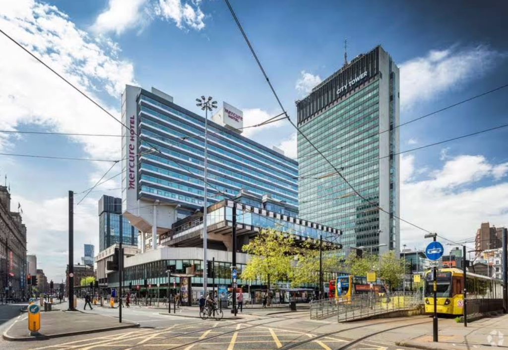
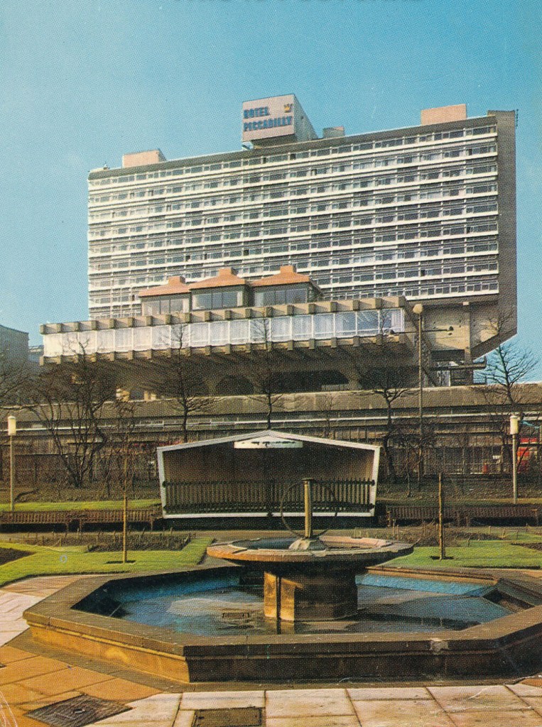
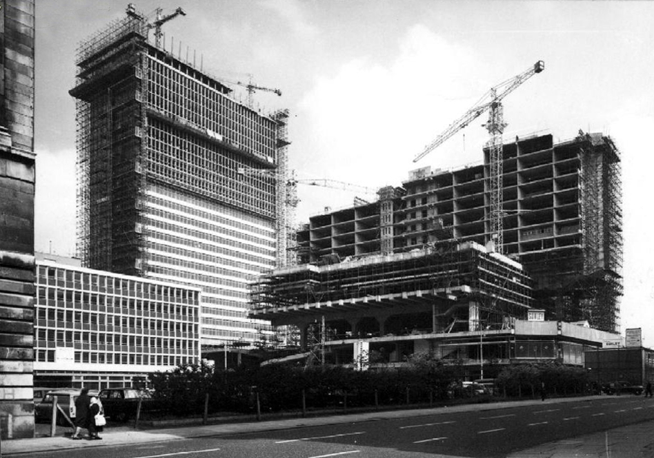
I arrived in Manchester on a cloudy afternoon, naturally. I stepped off the Metrolink at Piccadilly Gardens, dragging my backpack and carry on (both my partner and bag of hard drives and laptops), expecting the usual bustle of a city centre. What I didn’t expect was to look up and be struck by a building that felt like it had been airlifted out of a Soviet utopia and dropped squarely into the English skyline.
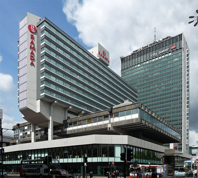
There it stood—patched with mismatched signage and ad hoc cladding, monolithic and unapologetic. Later that evening, in a burst of hotel-room Googling, I’d learn it once went by a different name: Piccadilly Plaza.
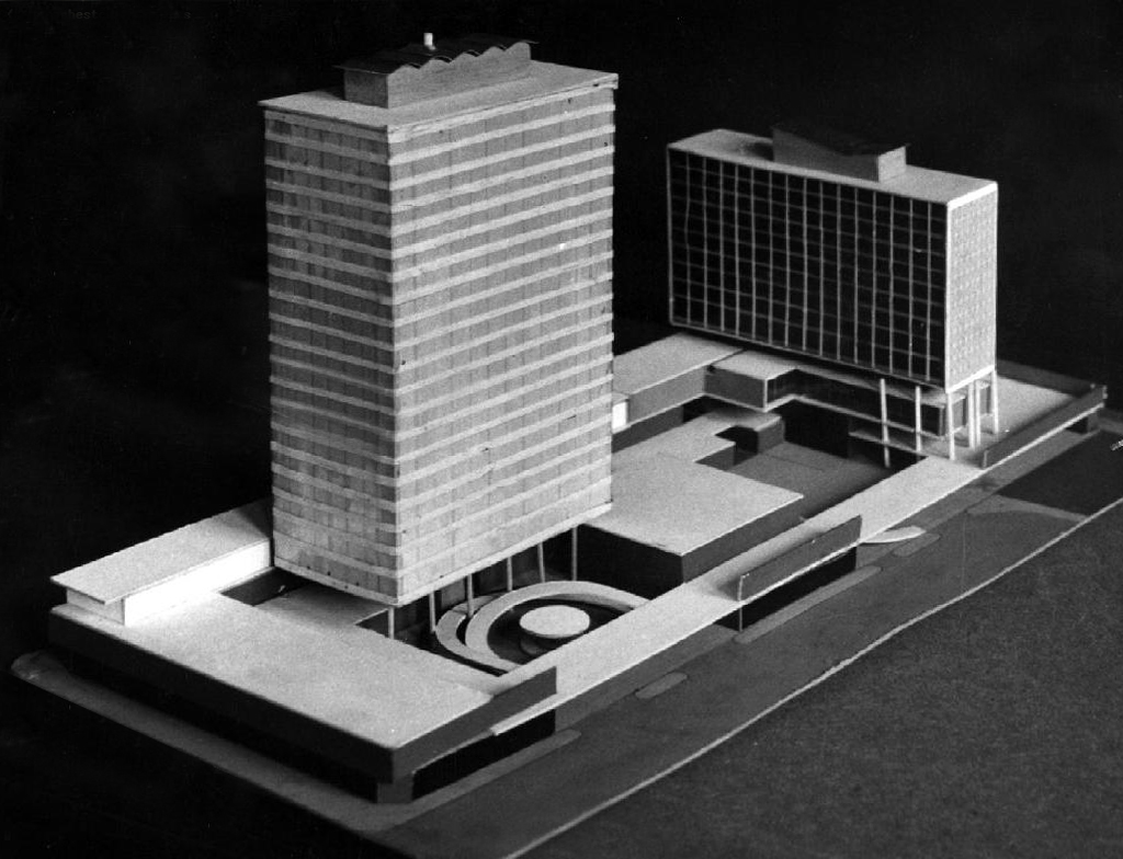
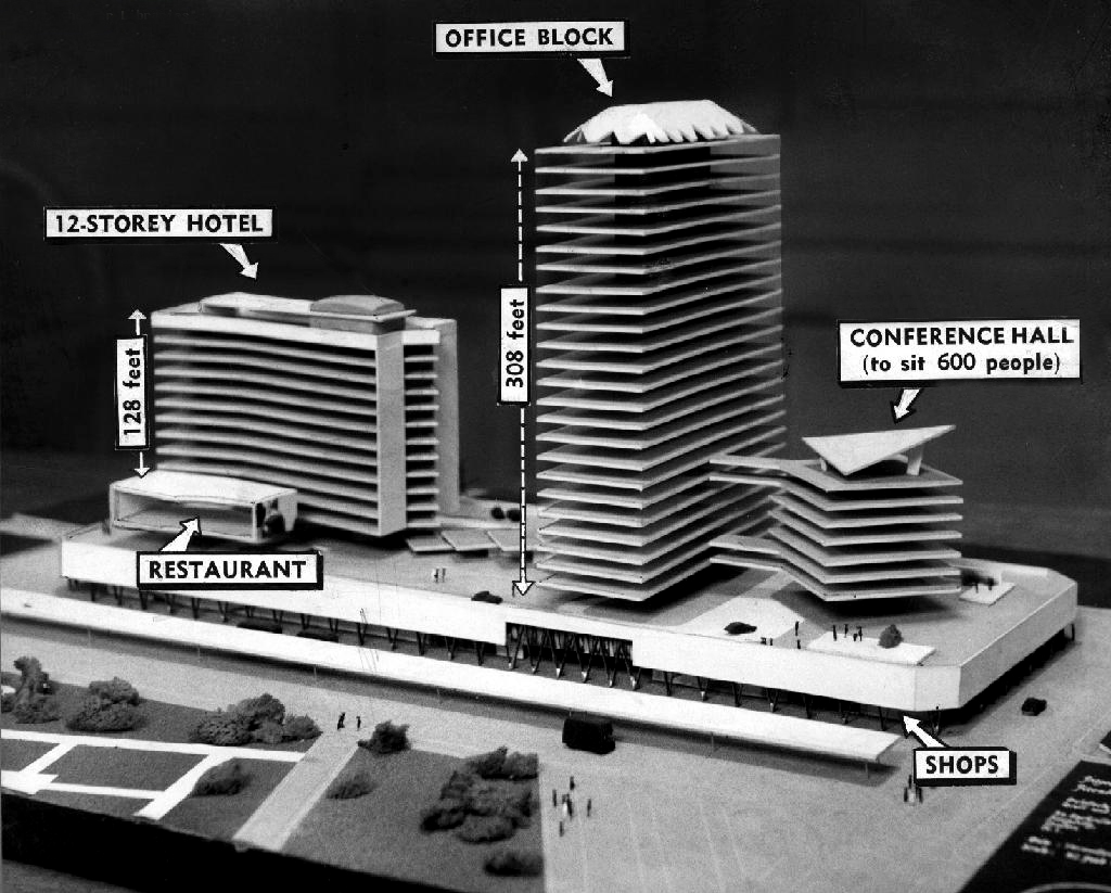
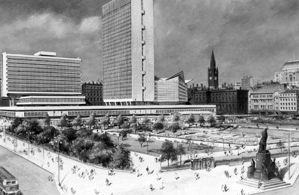
Piccadilly Plaza isn’t just a collection of buildings, it’s a complete architectural vision, fully cast in concrete. Rising from the heart of Manchester in the 1960s, this collection of modernist structures and forms was more than a commercial development. Envisioned as a self-contained urban district, and much like many great Modernist projects, it promised a new way of collecting and organizing civic life: offices, hotels, conference halls, restaurants, and retail, all into a unified piece of architecture.
It wasn’t just the height—though it still commands the skyline as one of Manchester’s tallest towers. It was the scale in every direction: a bold, unapologetic slab of concrete and glass that spans an entire city block, anchoring the Plaza with its sheer presence. Its form totally monumental and deliberate, unapologetic sculptural, aggressively modern, ideologically brutalist.
Brutalism is often misunderstood and seemingly only favoured nowadays by the ultra-nerdy architecture types (like myself). People associate it with dull grey apartment blocks, or the under-maintained urban projects in in nearly any city around the globe. But when you take the time, to really look at the ‘architecture’, that is the form, the structure, the gestalt, you see something else: romantic utopianism.
Piccadilly Plaza is a statement of aspiration. It occupies an entire city block with deliberate force, a megastructure of stacked uses, elevated walkways, cantilevered masses, and a matrix of mechanical support elements all worked into one complete plan.
The separation between base, podium, and tower is textbook modernism. You can feel its 1960s ambition reaching up embodying progress (albeit sampled quite obviously from the Soviets, and Frank Lloyd Wright too if you ask me), to give Manchester the kind of grand gesture that acknowledges the cities significant mark and position in history, both past and ongoing.
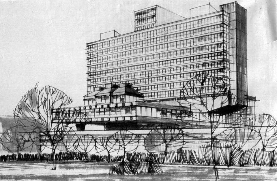
The 12-storey hotel floats above street level on massive pilotis, its slab-like form cutting horizontally across the site with absolute confidence. Beside it, the office tower rises with a kind of cool authority, anchoring the ensemble. At the plaza’s base, a wide platform of shops and concourses stretches along the street edge, lifted above the pavement like a stage. This was urbanism by architecture — the city reorganised through a modernist vocabulary of levels, volumes, and programs.
Every element was meant to serve a purpose: the hotel for business travellers, the conference centre as civic infrastructure, the retail podium as connective tissue. And yet, the result wasn’t just functional—it was visionary in its scale, a spatial diagram of how postwar Britain imagined the future: engineered, optimistic, and dramatically concrete.
Historical Dig: From my Hotel Room Curiosity to Architectural Archive
Back in my hotel, I did what any good nerd would do: I fell into a research hole. First stop: Sunley House. Designed by Covell, Matthews & Partners, built between 1959 and 1965, it was part of the larger Piccadilly Plaza scheme—a modernist reimagining of Manchester’s commercial core.
I found photos of the original architectural model, all sci-fi angles and optimistic scale figures. Drawings of the plaza’s grand vision, with annotations calling out to main zones (form truly follows function here). Grainy photographs from the 60s and 70’s showing the building taking life and the city operating around it.
And then: transformation. By the 2000s, it had been reclad, renamed, reimagined. Leslie Jones Architects added cladding with a kind of abstract circuit-board motif. A palimpsest of eras, layers of renovation, ownership changes, and cultural reappraisal.
At the rear of the complex, partially hidden, I found the spiraling ramp of the parking garage, a perfectly geometric coil of concrete that felt like something from a Corbusier sketchbook. Functional and sometimes all too common, but here it was sculptural too.
And then the windows, they don’t sit flush with the facade but project outward, essentially like capsules. From a distance, they break the mass of the tower into a kind of futuristic-mechanical rhythm—like space pods. Up close, they reveal their logic, once again in a Corbusier inspired aperture allowing more light in, creating a deeper reveal for shade, emphasizing the building’s depth and density.
Final Impressions from a Future That Was
What fascinated me more than any single building was how the entire Piccadilly Plaza was conceived as a total architectural composition. Each mass had a role to play. The 12-storey hotel, curved and horizontal, set up a conversation with the vertically dominant office block. The conference hall, with its dynamic, cantilevered planes, added a theatrical counterpoint, more like a civic sculpture than a hotel or mall complex. Even the low-slung restaurant and retail plinth pulled it all together with a Wrightian composition and rhythm. This wasn’t just a development, it was a city-scaled diagram of modern life, sculptured by use and expressed through form.
What endures in Piccadilly Plaza isn’t just concrete or geometry—it’s conviction. The entire project reads like a built creed of mid-century modernism: that architecture could shape behavior, organize civic life, and express the values of a rational, collective future. There’s something deeply moving about that—the way these buildings still carry the weight of their utopian ambitions, even as the city changes around them.
Decades later, we may look back with irony or critique. But standing beneath these forms, walking their shadowed podiums and ramps, you can still feel the clarity of purpose. A belief—not just in building—but in building better.
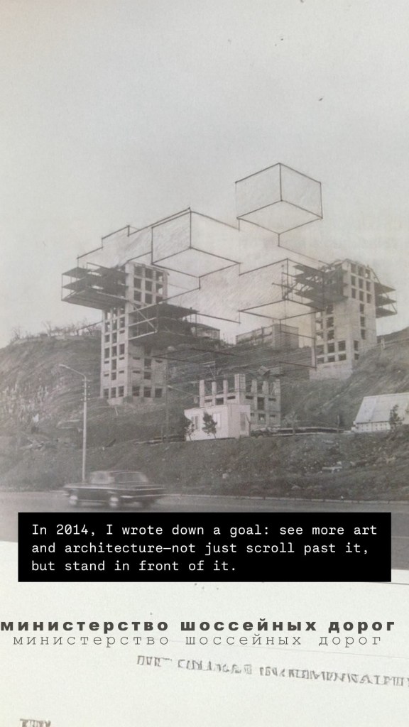
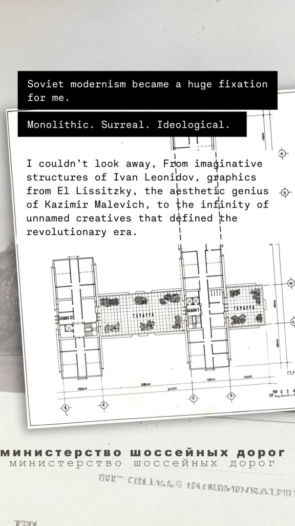
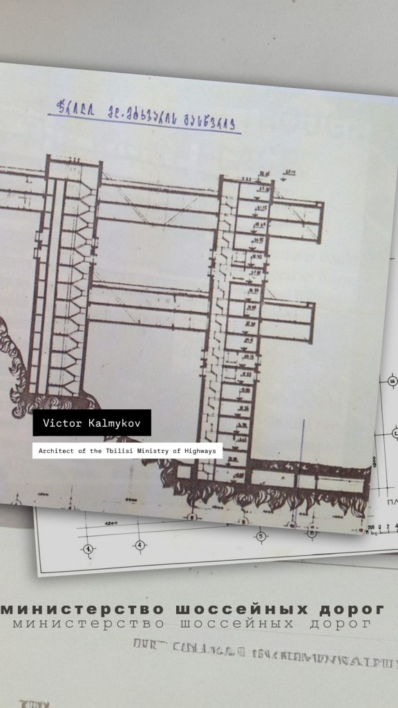
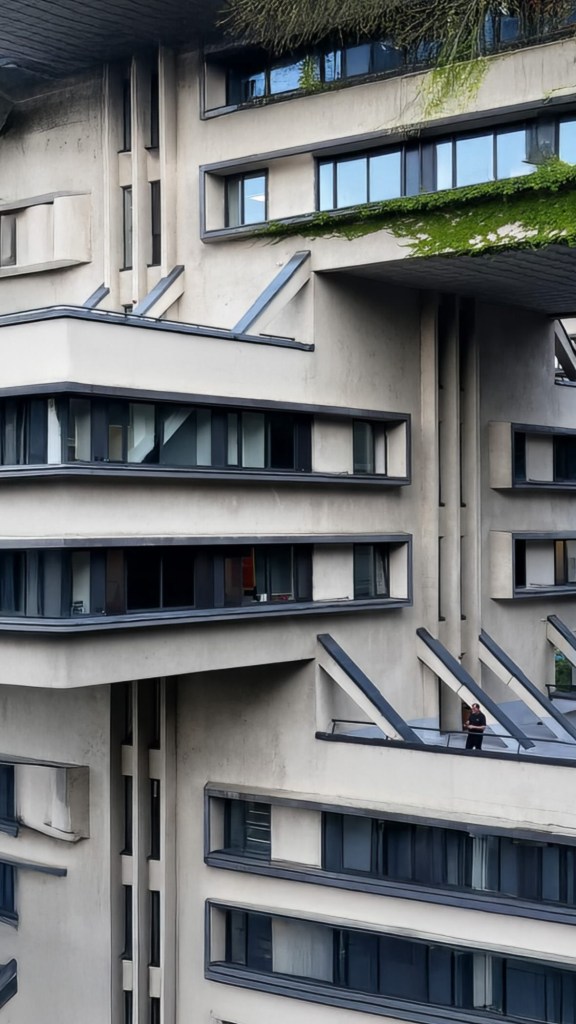
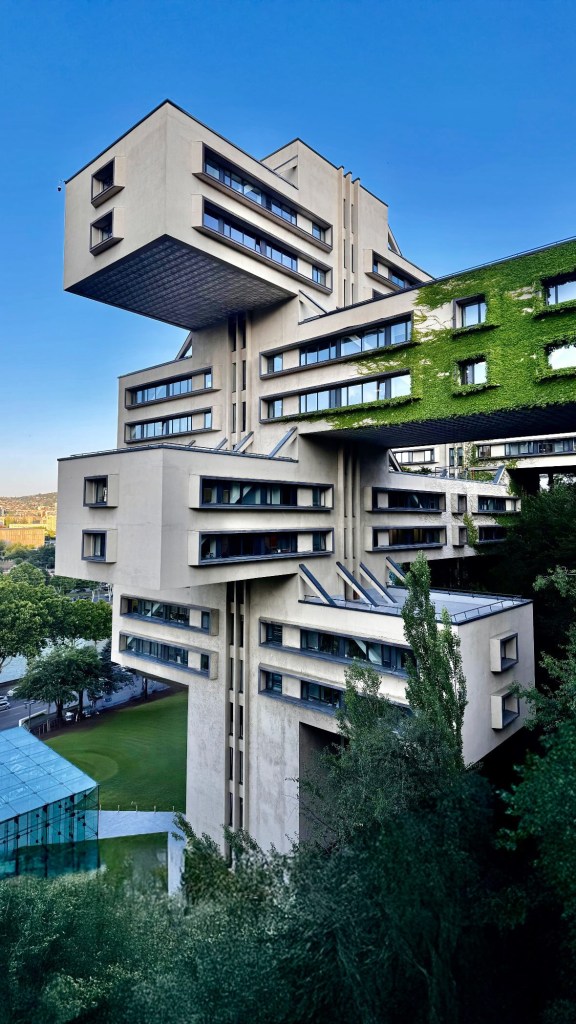
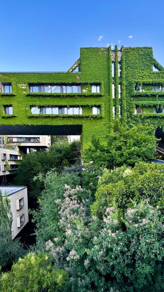
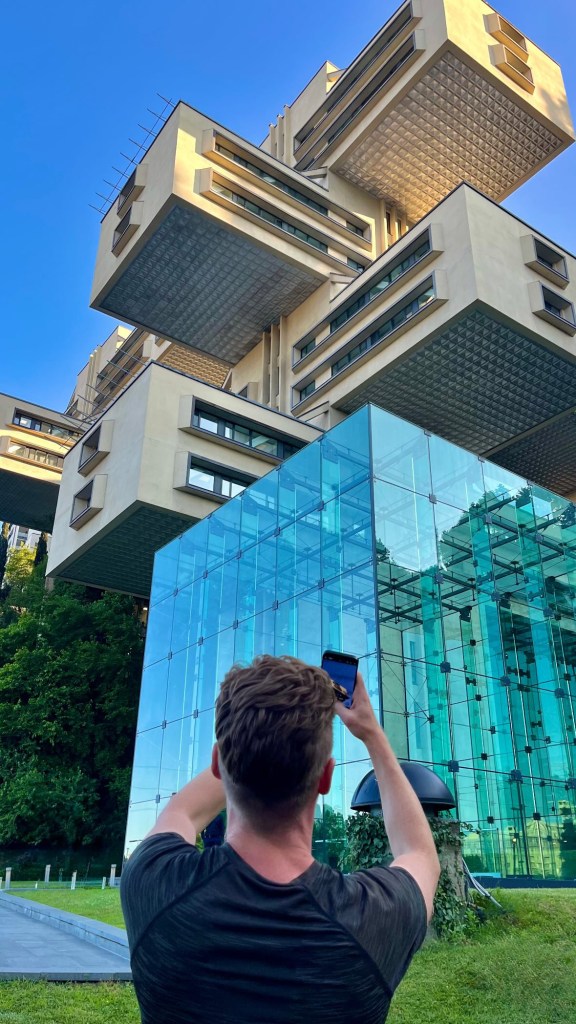
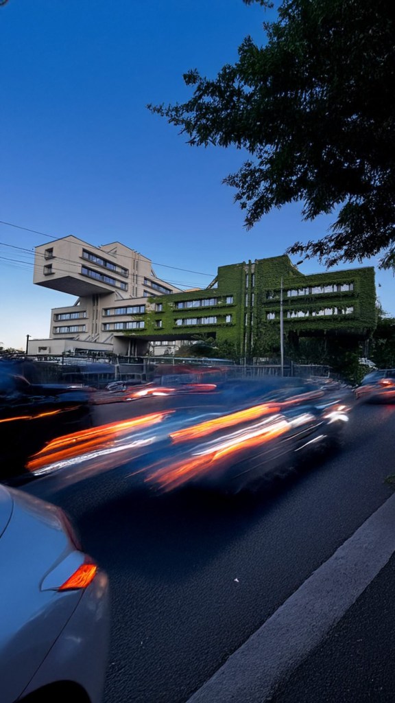
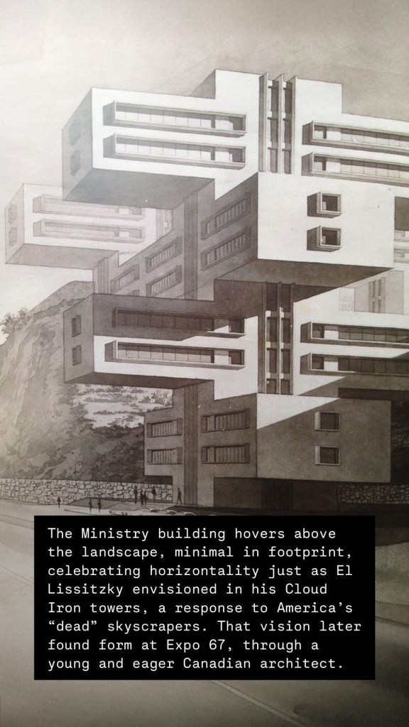
Tbilisi, Georgia – 1975 Architects: George Chakhava & Zurab Jalaghania
On my last day in Georgia, I made a small pilgrimage. Not to a church, but to a building. The Ministry of Highways, confidently rising on a forested slope at the edge of Tbilisi. It’s not downtown, not on a plaza, not trying to be seen by crowds, but deliberately away from the city accessible only by motorcar. That’s what immediately stood out to me: this was never meant to be urban spectacle. It was always meant to celebrate the automobile, yet remain in sync with nature — a vision that feels completely contradictory today, but made perfect sense in an era when Garden Cities, suburban expansion, and endless highways were imagined as a kind of utopia.
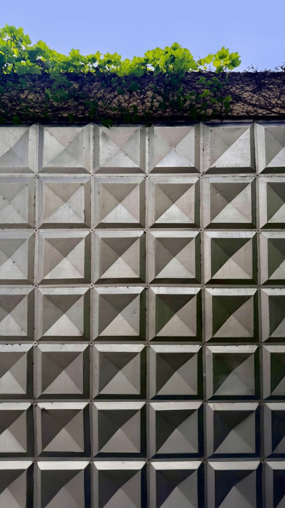
The building emerges suddenly from the trees as you drive around the bend. Five massive concrete slabs stacked and cantilevered like intersecting roadways, hovering just above a sprawling parking lot. It feels like it landed there. A kind of brutalist UFO with roots in both Soviet utopianism and deep architectural theory.
What continues to fascinate me is the ideological ambition embedded in this form. It wasn’t just about aesthetics, it was about a different vision of how people live and work. In contrast to the American skyscraper’s verticality, Soviet theorists like El Lissitzky imagined “cloud iron” towers: horizontal, interconnected forms elevated above the ground to preserve nature and reduce alienation. This building takes that radical idea and makes it real.
Chakhava, the architect (and then-minister of highways), used his position to bypass the bureaucracy and get it built, one of those rare moments where vision and authority aligned. The result is something totally singular, yet part of a broader moment in architectural experimentation.
It also reminds me of Moshe Safdie’s Habitat 67, another radical structure from the same era. Though very different in context, both projects share a resistance to monolithic verticality. They’re fragmented, modular, human-scaled in their own alien way. Buildings that want to touch the ground, not dominate it.
And I can’t help but wonder: what did the Japanese Metabolists or the British experimental collective Archigram make of this building — if they saw it at all? The Ministry feels like it could have stepped out of one of their sketchbooks or collages: infrastructural, spatially ambitious, and deeply in tune with the landscape. Maybe it was a case of parallel thinking, ideas blooming independently across continents, shaped by a shared optimism about architecture’s potential to reshape life.
That lineage doesn’t end there. Decades later, architects like Will Alsop would carry those ideas forward, not as theory, but as built form. His Sharp Centre for Design in Toronto, with its bold tabletop hovering on tilted stilts, channels that same defiance of gravity and convention. It takes the modularity and elevated logic of Archigram and the Ministry, and infuses it with colour, wit, and a distinctly public spirit. Where Chakhava floated infrastructure above nature, and Archigram envisioned cities in motion, Alsop gave these radical gestures a place in the everyday city. It’s a throughline of architecture as both infrastructure and fantasy, unapologetically expressive, but grounded in the real.
Standing beneath the stacked slabs of the Ministry, surrounded by trees and highway noise, it felt like architecture caught in a rare act of idealism. Not nostalgic, not naive, just radical.
Ministry of Highways, Tbilisi (1975) Architects: George Chakhava & Zurab JalaghaniaMinistry of Highways, Tbilisi (1975) Architects: George Chakhava & Zurab JalaghaniaMinistry of Highways, Tbilisi (1975) Architects: George Chakhava & Zurab JalaghaniaMinistry of Highways, Tbilisi (1975) Architects: George Chakhava & Zurab JalaghaniaMinistry of Highways, Tbilisi (1975) Architects: George Chakhava & Zurab JalaghaniaMinistry of Highways, Tbilisi (1975) Architects: George Chakhava & Zurab JalaghaniaMinistry of Highways, Tbilisi (1975) Architects: George Chakhava & Zurab JalaghaniaMinistry of Highways, Tbilisi (1975) Architects: George Chakhava & Zurab JalaghaniaMinistry of Highways, Tbilisi (1975) Architects: George Chakhava & Zurab JalaghaniaMinistry of Highways, Tbilisi (1975) Architects: George Chakhava & Zurab Jalaghania
There’s a quiet kind of magic in watching a city reinvent itself. Factories become art studios, railway yards sprout breweries and playgrounds, and once-forgotten churches glow again as homes filled with life. These transformations aren’t just clever design tricks — they’re proof that cities, like living organisms, have the power to adapt, to fold history into the future without erasing it. As an urban enthusiast, I find myself constantly drawn to these moments of reinvention. They remind me that a city’s beauty isn’t just in its skyline, but in its ability to evolve, reuse, and surprise us.
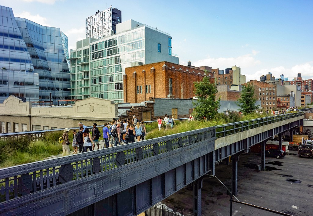
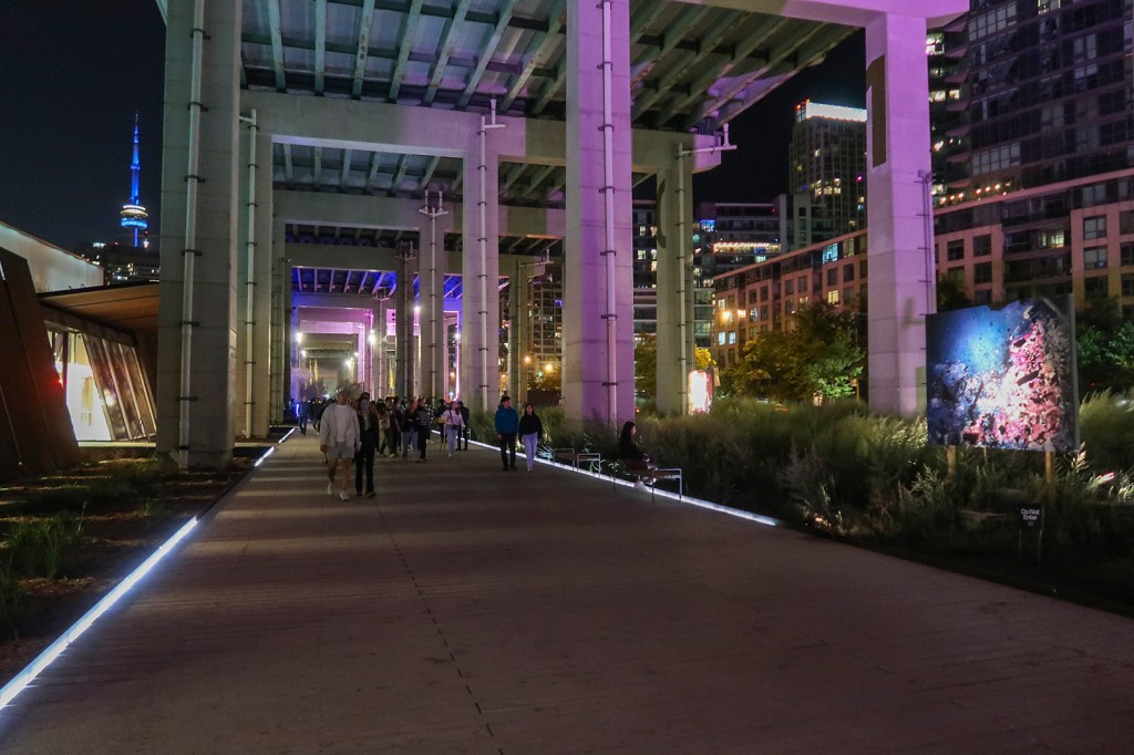
This fascination naturally leads me to the concept of adaptive reuse: the art of breathing new life into old forms. But the excitement doesn’t stop at buildings. Lately, I’ve been equally captivated by how we’re rethinking the spaces in between — the railways, highways, river channels, flood planes, and underpasses that shape the daily rhythm of urban life. Cities like Seoul, Toronto, Tokyo, and New York are transforming these overlooked fragments of infrastructure into parks, gathering spaces, and cultural hubs. These projects are more than beautification — they’re a celebration of possibility, showing how the ordinary can become extraordinary when we choose to see it differently.
Adaptive Reuse: Breathing New Life Into Old Forms
Adaptive reuse is perhaps one of the clearest expressions of a city’s resilience and imagination. What I love about it is that it doesn’t chase novelty for its own sake — it respects the bones of a place while giving it entirely new energy. Look at London’s Battersea Power Station: once a massive industrial powerhouse, it now hums with shops, homes, and riverside walkways, its iconic chimneys still anchoring the skyline. Or Vienna’s Gasometers, those enormous brick gas tanks, now wrapped around lively residential and entertainment spaces, where echoes of their industrial past add character rather than weight. These former industrial giants, with their generous proportions and raw materials, seem almost purpose-built for new creative lives. Today, they house studios, cultural venues, and public spaces, turning what were once production lines into cultural lifelines.
Stadiums, terminals, and civic structures are especially fascinating. These buildings were designed to carry the weight of thousands, to serve as stages for collective experience — and they still do, just in new forms. Take Arenas de Barcelona: once a bullring echoing with the roar of the crowd, it’s now a bustling mall and cultural destination, complete with a rooftop promenade that offers a new way to see the city. Or Hamburg’s Elbphilharmonie, where a utilitarian warehouse has been crowned with a crystalline concert hall, becoming both a world-class cultural venue and a new icon for the city. Even sacred spaces like decommissioned churches continue to find second lives, transformed into luminous residential projects or cultural landmarks. There’s something deeply moving about these adaptations — they preserve the scale and spirit of the original structures while weaving them into everyday life, reminding us that great design bridges history with the present.
Five of my favourite Adaptive Reuse Projects
1. The High Line — New York City, USA
2. Tate Modern Power Station — London, UK
3. Zeitz MOCAA — Cape Town, South Africa
4. Gasometers Mixed Used Development — Vienna, Austria
5. Arenas de Barcelona Mall — Barcelona, Spain
Infrastructure Beautification: Finding Joy in the In-Between
But cities don’t live by buildings alone. In fact, some of the most exciting transformations happen in the connective tissue of urban life — the infrastructure that moves us, shapes us, and often goes unnoticed. Infrastructure beautification is about turning these often-overlooked spaces into places of genuine beauty and human experience. Sometimes, this means rethinking what infrastructure is for in the first place.
Take Toronto’s CIBC Square Park, for example, built over an active rail corridor. What could have been an eyesore is now a green, elevated space that connects neighbourhoods and gives people a place to pause above the rush of trains below. In Seoul, the Cheonggyecheon stream restoration is a masterpiece of urban healing — a concrete flood channel stripped away to reveal a natural waterway, returning life and leisure to the heart of the city. Elsewhere, airports are evolving into destination spaces, not just points of departure. Elevated highways are being reimagined as parks, and underpasses — once dark, neglected voids — are being claimed for culture and community. Toronto’s Bentway is a brilliant example, while Tokyo’s lively restaurant and bar districts tucked beneath train lines prove that no space is too awkward for great urbanism.
The High Line in New York is perhaps the most celebrated hybrid of adaptive reuse and infrastructure beautification. A relic of industrial rail transport now serves as an elevated park and cultural destination, seamlessly blending nature, art, and history. Similarly, Los Angeles is rethinking its flood control channels as potential public spaces, exploring ways to transform concrete chasms into vital community corridors.
Patterns and Reflections: Reading the City Differently
What connects all of these examples, I think, is a shared impulse: to see potential where others see limits. Adaptive reuse and infrastructure beautification both start with a simple but powerful question — what if this space could be more? In both cases, we’re not starting from scratch, but rather working with what already exists, peeling back the layers of time to reveal new opportunities. There’s a respect for history here, but also a quiet optimism about the future. These projects prove that we don’t have to choose between preservation and progress. In the best cases, we get both.
It’s also about reclaiming spaces for people. When we transform infrastructure into places of culture and connection, we shift the narrative from efficiency to experience. The old logic of design prioritized movement — getting from point A to point B as fast as possible. But these interventions invite us to slow down, to linger, to enjoy the journey itself. Parks over railways, restaurants under train lines, rivers restored to life — they all create moments of surprise and delight in the in-between spaces of the city.
As I continue to collect these examples, I see them less as isolated projects and more as part of a growing global inventory of urban ingenuity. Each one is a reminder to keep looking closely at the overlooked, to stay curious about what lies beneath the obvious. I hope this informal inventory sparks the same curiosity in you. And if you come across a great example in your own city, I’d love to hear about it — this is, after all, an ongoing conversation.
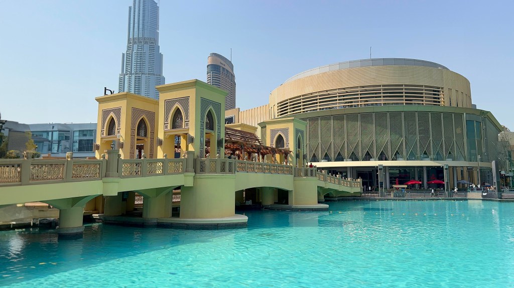
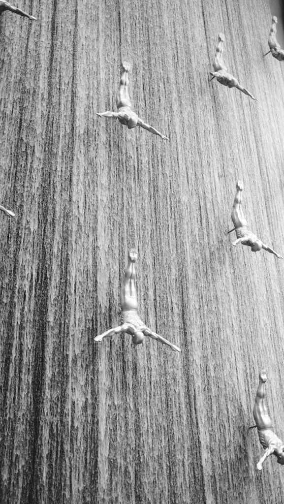
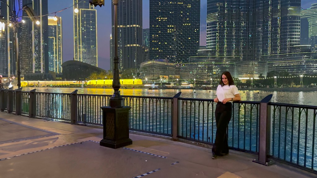
Dubai Mall. If there was ever a place to prove that “everything is bigger and better in Dubai,” this is it. Imagine a place so large that I thought I was on a never-ending treasure hunt for cool spaces—and trust me, I almost gave up at one point. But then, I remembered: I’m here to record! So, armed with a camera, a growing appreciation for ultra luxury commercial-grade interior design, and an absolute sense of wonder, I embarked on my Dubai Mall recording journey.
Let me take you through it.
Intro Preview: The Calm Before the Mall Storm
Before stepping into the cavernous beast that is Dubai Mall, I gave the camera a quick intro. “Today, we’re diving into the world’s largest shopping and entertainment paradise,” I said, trying not to sound too cliché. Spoiler alert: there was a lot of excitement behind my words. A mall that’s both an oasis and a labyrinth in the desert—what’s not to love?
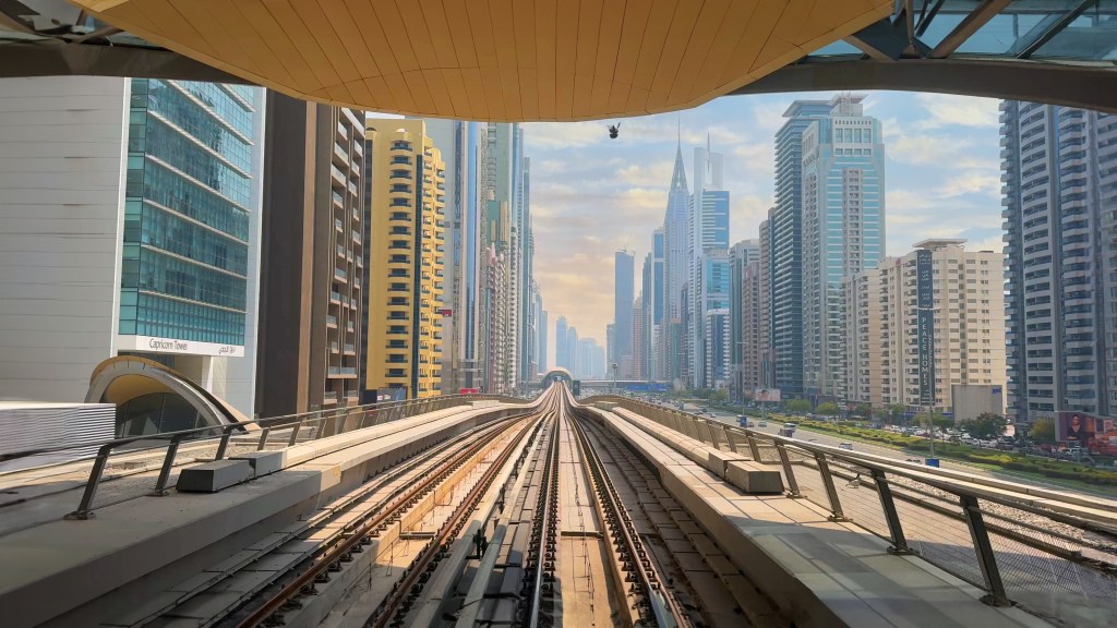
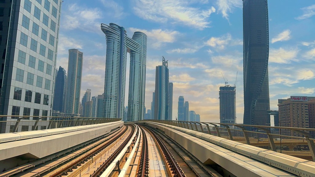
The Dubai Metro Ride into Dubai Mall: Public Transportation, But Make It Luxe
I hopped on the Dubai Metro, which, if you haven’t experienced it, feels like a futuristic bullet train. No need to worry about getting lost though—once I got to the station, the mall practically greeted me like an old friend. The spacious, sleekly designed station led me straight into the grandiose maze. And let me tell you, the entrance wasn’t just a passageway—it was a portal to a world of opulence. The walls? Smooth. The floors? Reflective. The atmosphere? Efficient but slightly intimidating, like it was saying, “Welcome to the empire.”
Dubai Mall Entrance: Where Ambition Meets Architecture
The entrance is nothing short of breathtaking. I swear, I stood there for about 3 minutes, half confused, half in awe, wondering if I was still on Earth. The design was stunning—every corner an architectural marvel, and the materials used were so sleek that they could’ve been imported straight from a sci-fi film set. I began to understand why they call this place a “shopping experience” and not just a mall.
Babel Dubai Luxury Restaurant & Patio View: So Good You Forget About Food
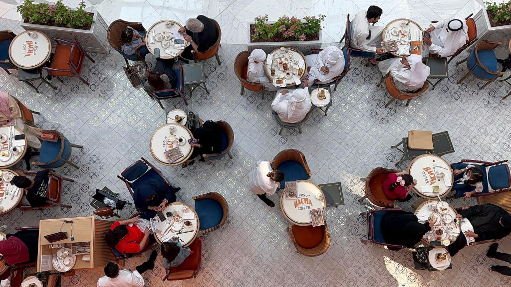
Moving on to Babel, the Dubai Mall luxury restaurant, I can’t even describe how I felt walking onto the patio. The view from here wasn’t just pretty; it was the kind of view that makes you question your life choices. Sitting there, staring out at the futuristic skyline, I felt like a character in some movie where everything’s perfect. The interior? Oh, it screamed luxury. Soft lighting, plush seating, and the perfect balance of sophistication and comfort. I didn’t want to leave—and I’m pretty sure the interior designers behind this place have won awards, if not hearts.
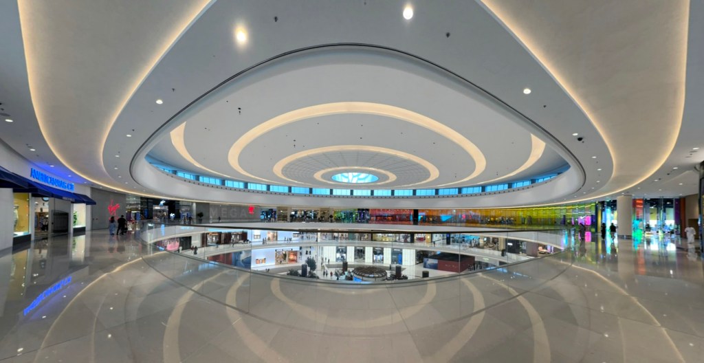
Dubai Mall Grand Atrium: This Place is HUGE
I’m talking about an atrium that could fit several other malls inside it and still have room for more. Walking into the Dubai Mall Grand Atrium, I felt tiny. I was like an ant in a very chic, well-curated design space. The light fixtures were so grand they looked like pieces of modern art, and the space was so well-lit that I felt like I was strolling through an Instagram filter in real life.
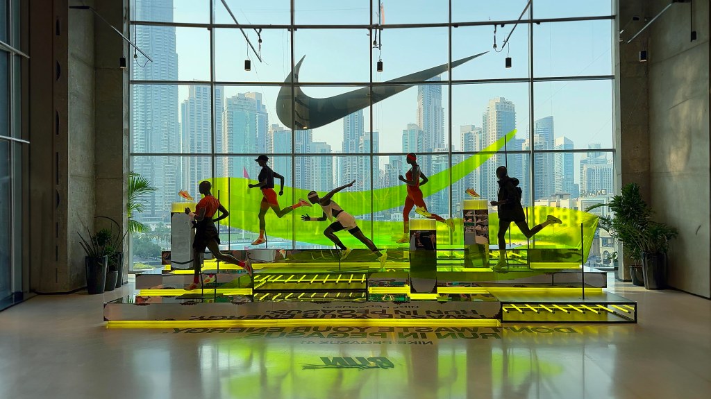
Nike Store Dubai Mall: Getting My Sneakerhead On
I wandered into the Nike Store, and wow, let me tell you, it felt like stepping into the matrix of sneakers. Every wall, every shelf—pure commercial design genius. And the store was SO sleek! But it wasn’t just the shoes that caught my eye—it was the seamless design elements throughout. If you’ve ever wondered what a “sports paradise” looks like, this store is it.
Future Digital Display Walk: The Future Is Now
I thought I was entering a tech exhibit, but no—this was just a walk through Dubai Mall. The digital displays along the walkway felt like they were from a science fiction movie. Every ad was a mini-interactive experience. Honestly, I kept waiting for a robot to appear and start talking to me, but no such luck.
Level Luxury Shoes Area: For Those Who Think Shoes Are Art
Level Luxury is not just a shoe area—it’s a gallery. I mean, wow, the interior here is something else. Everything about it screamed “high-end”—from the gleaming, polished floors to the carefully curated lighting that made the shoes feel like they were on display in a museum. A museum for the feet, that is.
Human Waterfall: A Marvelous Miracle of Engineering
I stumbled upon the Human Waterfall (no pun intended) and couldn’t help but stop and stare. This waterfall—flowing vertically down the walls—is a miracle of design and engineering. Honestly, I was waiting for someone to tell me this was just an illusion, but nope, it was real. The sound, the movement, the way the water complemented the architecture—it was mesmerizing. If only we could have this in every mall, right?
Dubai Mall Ice Rink in the Desert!
Wait—an ice rink in the desert? Yes, Dubai is that extra. Stepping onto the ice rink made me realize I had officially entered a mall that takes no shortcuts. This rink felt like something straight out of the Winter Olympics. And the design? Perfection. It wasn’t just the ice that impressed me—it was the surrounding environment, which made me forget I was in the desert. Seriously, who thought this would be possible?
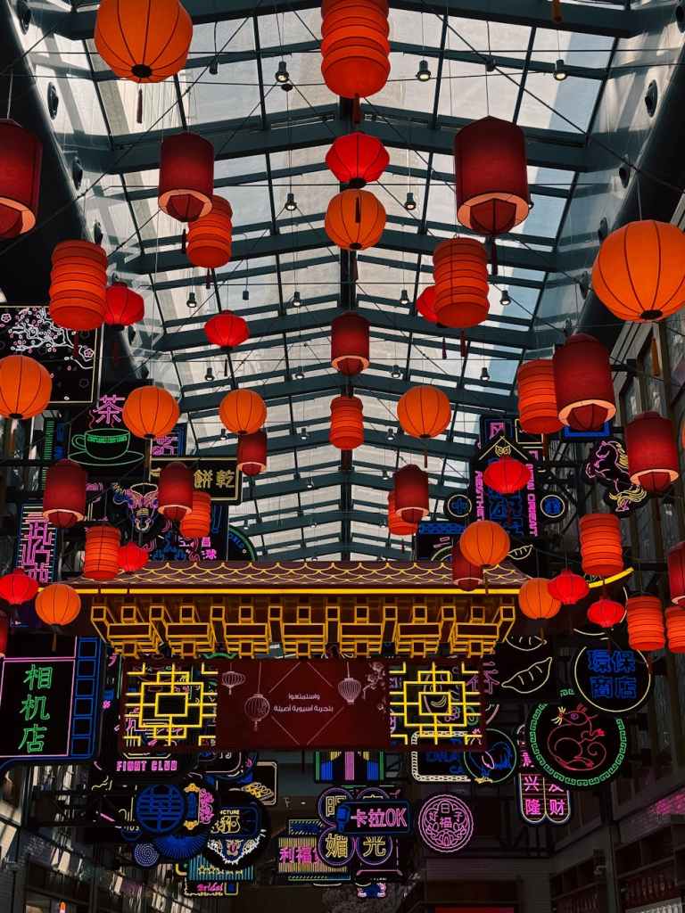
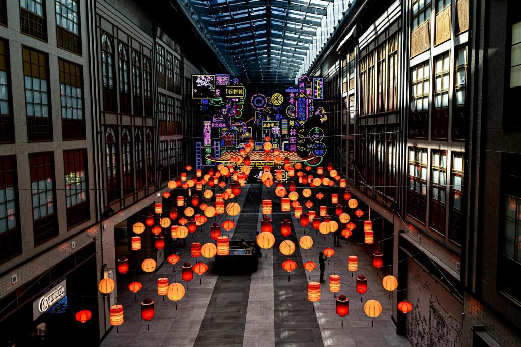
Chinatown Dubai Mall and Asian Street: Get Your Dim Sum On
At this point, I was in the mood for a snack, so I made my way to Chinatown. The interior was lush and vibrant, with colourful lanterns and bold designs that made me feel like I was transported to another world entirely. Asian Street? More like “flavor explosion.” Don’t even get me started on the food.
Fossilized Dinosaur Skeleton: The Real Deal
Yes, you read that correctly—a fossilized dinosaur skeleton in the mall. And no, it wasn’t behind some velvet rope—it was just… there. A perfect blend of natural history and commercial design, this piece was artfully displayed and made me feel very small and mortal—which, you know, was a vibe.
Aquarium: Stingrays, Sharks, and More
My journey wasn’t complete without stepping into the Dubai Mall Aquarium. It’s almost as if they took a little piece of the ocean and brought it indoors. The design here was inspired, with the gigantic tank framed by a massive glass tunnel. Fish, stingrays, and even a Great White Shark (yep, you heard me right) swam by, and I’m convinced that aquarium designers are part wizard.
Dubai Mall Candy Store: Where Sugar Dreams Come True
The Candy Store. If I could live in here, I would. The design was pop-art meets Willy Wonka, and I swear every corner had candy that looked too good to eat. But you know, I ate it anyway.
Dubai Mall Atrium: Final Glance
By now, I was in full-blown mall overload. The atrium, with its soaring ceilings and gleaming floors, was the cherry on top of this indulgent, retail feast. It was like the entire space had been custom-designed to make me feel awe-struck at every turn.
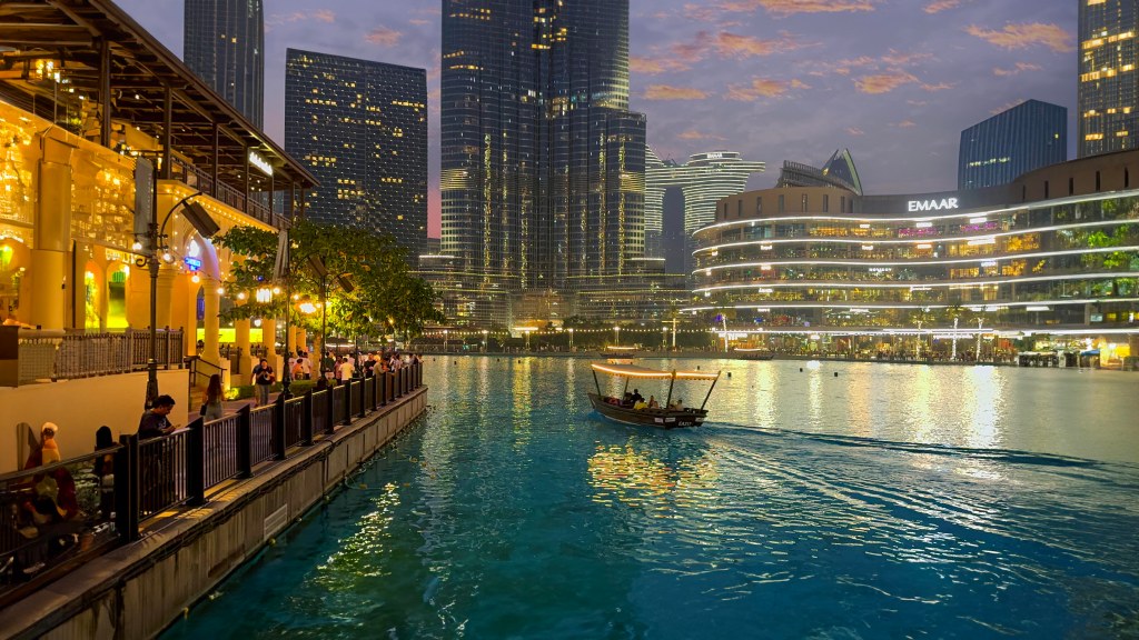
Dubai Fountain Light Show: A Grand Finale
And finally—THE Dubai Fountain. When the lights dimmed, and the music started, I realized why this was a global phenomenon. The water shot up to heights I didn’t think were possible, all while synchronized to the music. The sound, the lights, the movement—it was enough to make anyone forget they were in a shopping mall. This was a show worthy of the grandest stages.
At its core, the Genbe River walk is an act of urban rediscovery, an effort to peel back the layers of concrete and asphalt that typically define Japanese cityscapes, revealing the natural landscape underneath. Unlike traditional urban rivers that are often relegated to underground canals or lined with rigid concrete embankments, Genbe is a celebration of organic flow, where the river is respected, not controlled.
Instead of forcing nature into a rigid urban grid, this walkway was designed to work with the river, allowing its winding paths, small stepping stones, and gentle slopes to guide pedestrians as if they were meandering through a forest trail, not a city center. The stone walkways appear almost incidental, as if the city simply adapted to what was already there rather than imposing an artificial order.
Architecture That Listens to Nature
One of the most striking aspects of the Genbe River walk is its sensitivity to the landscape. The design choices reflect an understanding that architecture should complement rather than dominate nature. Instead of towering structures or imposing bridges, the walk is punctuated with subtle, human-scaled interventions:
Floating wooden decks extend gently over the water, offering spaces for quiet contemplation.
Stepping stones encourage engagement with the river, making walking through the space a tactile and playful experience.
Moss-covered stone walls merge human-made structures with the surrounding greenery.
Low bridges and shaded pathways frame the scenery rather than overshadow it, creating an intimate connection with the river.
This is more than just a pedestrian route—it’s a multi-sensory space, designed to make people feel the presence of water, hear its movement, see its clarity, and experience it as a living entity rather than a backdrop. The materials used—natural wood, local stone, and organic plantings—enhance the feeling that this is a space that was revealed rather than constructed.
A Parallel to Seoul’s Cheonggyecheon Restoration
The Genbe River walk draws intriguing comparisons to Seoul’s Cheonggyecheon River project, another urban intervention that reintroduced a river into the city’s landscape. Both projects share a common goal: to reclaim a natural waterway from urban encroachment and give it back to the people. However, their approaches diverge in interesting ways.
Cheonggyecheon was a large-scale excavation, removing a multi-lane highway to make space for a grand urban park. It was a bold, top-down transformation.
Genbe River, in contrast, feels delicate and intimate, as if the city simply made space for nature rather than reshaping it. Its charm lies in its humility, its ability to blend seamlessly with the existing landscape rather than redefine it.
Both projects, however, reflect a growing urban design philosophy that prioritizes ecological restoration, pedestrian accessibility, and public space over car-centric planning.
A Model for Future Cities
The Genbe River walk offers a compelling template for rethinking urban space. Instead of viewing nature as something separate from the city, it asks:
What if rivers were not obstacles but guiding pathways?
What if walking routes followed the rhythm of the land rather than a rigid grid?
What if urban spaces were designed to reveal rather than impose?
As cities worldwide grapple with overcrowding, climate change, and the need for more public green spaces, projects like the Genbe River walk remind us that the best urban design is not always about building more, but about uncovering what was already there.
This is architecture as reverence, an approach that doesn’t just use nature as an aesthetic tool but treats it as a collaborator in the design process. It’s a love letter to water, stone, and movement—and a rare, poetic intervention in an era of relentless urban expansion.
As we move forward, how can more cities take inspiration from this kind of attentive, sensitive urban planning? Have you encountered other urban spaces that celebrate nature in a similar way?
Growing up in Canada, skating was as natural to me as walking. Whether it was on freshly flooded rinks, frozen ponds, or even the occasional stretch of river behind my house, I always found joy in carving lines into the ice. But nothing could have prepared me for the sheer endlessness of the Rideau Canal. As I laced up my skates on the edge of this legendary skateway, Ottawa lay buried under 80 cm of freshly fallen snow, a gift from back-to-back winter storms.
The streets were hushed, muffled by towering snowbanks, but here on the ice, life carried on—gliding, spinning, laughing. The winter I had always known, the one I had learned to love through years of travel and experience, had never felt more alive than it did in that moment.
After a few loops, I step off the ice and head toward the ByWard Market, where warm lights glow against the frost-covered streets. Festive wreaths, twinkling garlands, and cozy cafés invite me in. The scent of hot chocolate and wood-fired treats drifts through the air, completing the perfect winter day in Ottawa.
Stepping onto Spark Street, I’m immediately surrounded by the magic of Winterlude—twinkling lights, intricate ice sculptures, and the laughter of families bundled up against the cold. The air is crisp, the snowfall thick, blanketing the city in a hushed, wintry embrace.
As I stepped off the ice and back into the snow-covered streets of Ottawa, I couldn’t help but take one last look at the canal, now glowing under the soft shimmer of streetlights. My legs ached from hours of skating, my face was flushed from the cold, but my heart was full.
This experience had been more than just gliding across frozen water—it was a connection to Canada’s winter spirit, a celebration of resilience, and a reminder of why I have come to cherish the unique beauty of our seasons. No matter where my travels take me, I know that few things will ever compare to the feeling of skating endlessly through the heart of winter, surrounded by snow, history, and a city that embraces the cold like no other.